Linear regression’s “default mode” is estimating additive change in the outcome as an explanatory variable changes. That is, the results of what we are usually estimating can be interpreted like this:
All else being equal, a one-unit increase in our explanatory variable is associated with a \(\beta\) unit change in our outcome variable.
The key thing is that the model assumes a unit change in the explanatory variable is associated with a constant change in the outcome.
The idea of a constant change in the outcome for each unit change in an explanatory variable only goes so far. Instead, often what we are interested in is not an additive change but multiplicative change (or a percent change).
As an example, you’ve likely heard something like the following about the gender gap in wages:
A woman earns 85 cents for every dollar that a man in the same job with the same qualifications makes.
I’m just inserting 85 here as an example. Actual estimates vary and I haven’t done the homework to advocate for any particular one.
The statement implies, for example, that if a man’s job and characteristics lead him to have a predicted salary of $140,000, the predicted salary of a woman with that same job and characteristics would be $119,000 ($21,000 less). If a man had a predicted salary of $50,000, the equivalent woman’s predicted salary would be $42,500 ($7,500 less). As the man’s expected salary increases, the absolute magnitude of the salary gap increases, because the change is a constant change in percentage terms, not a constant change in absolute terms.
One might think a world of multiplicative changes would require leaving the linear regression framework. Fortunately: not so! Logarithms come to the rescue! All we need to do to exit regression’s default mode of additive change and instead fit a model of multiplicative change is to think of the outcome in logged terms.
California Housing Example
For this example, we are looking at data from the American Community Survey on the value of respondent homes (as reported by the respondent). We restrict attention to 2012-2019 respondents in California who live in single-family homes, which still leaves us with over 1.5 million homes.
We will be working with two explanatory variables in this example:
Year (coded as year since 2000)
Whether the respondent lives in the Bay Area (defined here as San Francisco, San Mateo, Santa Clara, Alameda, Napa, or Sonoma counties)
First we will just fit a linear regression model with homevalue measured in dollars (not logged):
. regress homevalue year bayarea

      Source |       SS           df       MS      Number of obs   = 1,598,651
-------------+----------------------------------   F(2, 1598648)   =  76972.42
       Model |  6.8647e+16         2  3.4323e+16   Prob > F        =    0.0000
    Residual |  7.1287e+17 1,598,648  4.4592e+11   R-squared       =    0.0878
-------------+----------------------------------   Adj R-squared   =    0.0878
       Total |  7.8151e+17 1,598,650  4.8886e+11   Root MSE        =    6.7e+05

------------------------------------------------------------------------------
   homevalue |      Coef.   Std. Err.      t    P>|t|     [95% Conf. Interval]
-------------+----------------------------------------------------------------
        year |   45826.22   230.3182   198.97   0.000     45374.81    46277.64
     bayarea |   491392.8    1455.73   337.56   0.000     488539.7      494246
       _cons |  -159425.1    3628.56   -43.94   0.000    -166536.9   -152313.2
------------------------------------------------------------------------------
We can interpret these results as meaning that the average home in the Bay Area was worth nearly a half million more than the average value of a home elsewhere in California, and that, whether it was in the Bay Area or not, the value of homes appreciated by about $46,000 a year during this period.
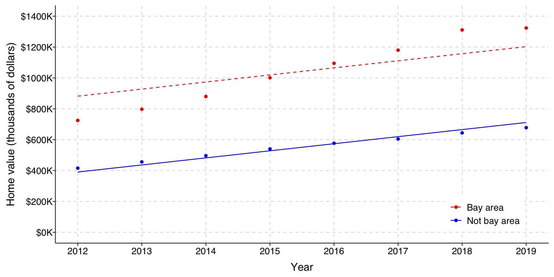
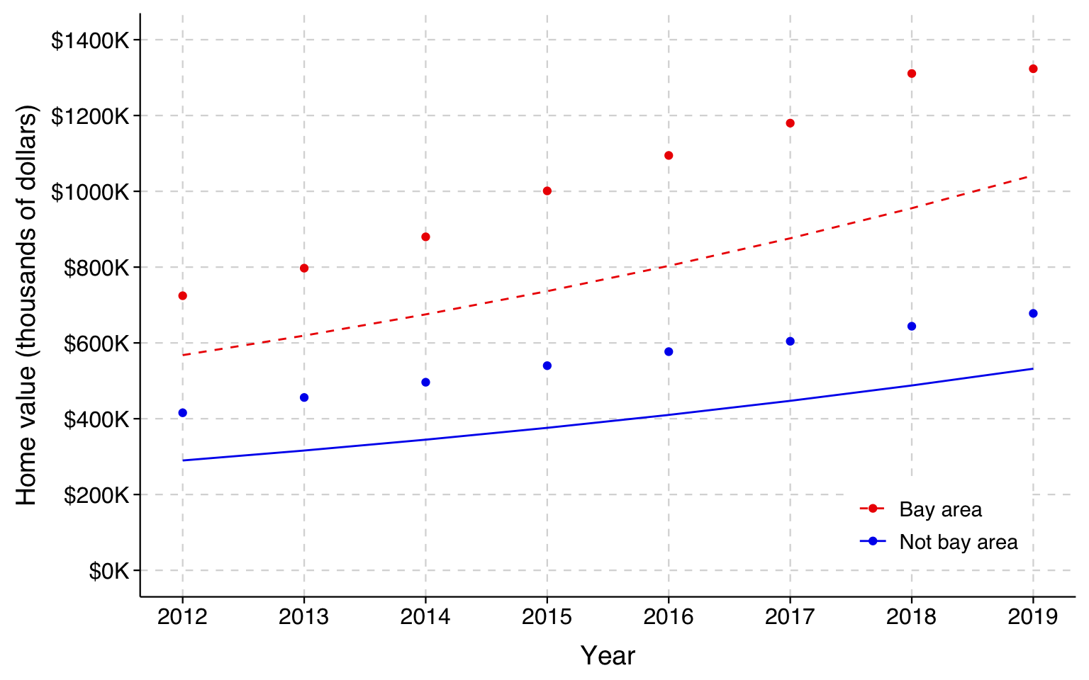
We can graph the predicted home values implied by the model for homes in and out of the Bay Area over time.
In this graph, the solid red line represents the estimated mean home value by year for homes in the Bay Area and the dashed blue line are homes outside the Bay Area. Because of how we have specified our model, the gap stays the same over time as home values rise.
In this graph, the light blue/red circles represent the actual mean home values in the respective years. As you can see from this, the model does well at fitting the means for homes outside the Bay Area, but misses the means for those in the Bay Area. Notice also that it overestimates the Bay Area means in the early years and underestimates them in the later years. In other words, the gap is increasing as home values increase, which is what we would expect if the difference was better characterized in percentage terms rather than absolute terms.
Now let’s log the outcome variable and fit the model again.
. use ../dta/californiahomes.dta, clear
(Extract from 2012-2019 American Community Survey via IPUMS)

. gen lnhomevalue = ln(homevalue)

. regress lnhomevalue year bayarea // note improved fit in R2 from additive model

      Source |       SS           df       MS      Number of obs   = 1,598,651
-------------+----------------------------------   F(2, 1598648)   =  95699.87
       Model |  158875.967         2  79437.9833   Prob > F        =    0.0000
    Residual |  1326996.34 1,598,648  .830074128   R-squared       =    0.1069
-------------+----------------------------------   Adj R-squared   =    0.1069
       Total |  1485872.31 1,598,650  .929454421   Root MSE        =    .91108

------------------------------------------------------------------------------
 lnhomevalue |      Coef.   Std. Err.      t    P>|t|     [95% Conf. Interval]
-------------+----------------------------------------------------------------
        year |   .0867466   .0003142   276.05   0.000     .0861307    .0873625
     bayarea |   .6724292   .0019861   338.56   0.000     .6685364     .676322
       _cons |   11.53602   .0049507  2330.19   0.000     11.52631    11.54572
------------------------------------------------------------------------------
The \(R^2\) for these estimates is .107, which is over 20% better than the estimates above. Logging the outcome measure, then, clearly improves model fit.
We could interpret these results as an additive change in logged dollars:
In a given year, homes in the Bay Area sold for about .67 logged dollars more than other homes in California.
Holding constant whether a home was in the Bay Area, the value of homes increased by about .087 logged dollars per year between 2012-2019.
But, unless you are talking to folks that spend a lot of their time thinking about the world in logged dollars, these interpretations are not very meaningful.
To interpret these coefficients more meaningfully, consider what happens to our outcome as year increases by 1, holding the other variables constant.
When year is \(x\): \[
\ln(\mathtt{homevalue}|\mathtt{year}=x) = \beta_0 + \beta_1 (x) + \beta_2 (\mathtt{bayarea})
\] which we can then convert to dollars by taking the exponent of each side (note that \(\exp(a + b) = \exp(a)\exp(b)\)): \[
\begin{align}
(\mathtt{homevalue}|\mathtt{year}=x) & = \exp\left[\beta_0 + \beta_1 (x) + \beta_2 (\mathtt{bayarea})\right] \\
\\
& = \exp(\beta_0)\exp(\beta_1 (x))\exp(\beta_2 (\mathtt{bayarea}))
\end{align}
\]
When year is \(x+1\): \[
\begin{align}
\ln(\mathtt{homevalue}|\mathtt{year}=x+1) & = \beta_0 + \beta_1 (x+1) + \beta_2 (\mathtt{bayarea}) \\
\\
& = \beta_0 + \beta_1 (x) + \beta_1(1) + \beta_2 (\mathtt{bayarea}) \\
\\
& = \beta_0 + \beta_1 (x) + \beta_1 + \beta_2 (\mathtt{bayarea})
\end{align}
\] which converted to dollars is: \[
(\mathtt{homevalue}|\mathtt{year}=x+1) = \exp(\beta_0)\exp(\beta_1x)\exp(\beta_1)\exp(\beta_2\mathtt{bayarea}) \\
\]
The way to simplify this is to look at the ratio of the predicted home value at our new (\(x+1\)) value of year to that at our old (\(x\)) value:
In words, as year increases by 1 unit, home value increases by a factor of\(\exp(\beta_1)\). That is: if we exponentiate the coefficients, we get a result that can be interpreted as a factor change in home value.
For year, as \(\beta_1 = .0867\), \(\exp(\beta_1) = \exp(.0867) = 1.091\). For \(\mathtt{bayarea}\), \(\exp(.6724) = 1.9589\). These can be interpreted as:
Net of whether a home is in the Bay Area, the value of California homes increased each year from 2012-2019 by a factor of 1.09.
Net of year, the value of homes in the Bay Area is higher than the value of homes elsewhere in California by nearly a factor of two.
We can convert factor changes to percent changes: \[ \mathrm{Percentage\ change} = (\mathrm{Factor\ change} - 1)*100 \]
Net of whether a home is in the Bay Area, the value of California homes increased each year from 2012-2019 by about 9%.
Net of year, the value of homes in the Bay Area is 96% higher than the value of homes elsewhere in California.
Now let’s see what happens when a coefficient is negative. Let’s refit the model including also when the home was built.
. regress lnhomevalue year i.bayarea ib3.builtwhen

      Source |       SS           df       MS      Number of obs   = 1,598,651
-------------+----------------------------------   F(4, 1598646)   =  48400.75
       Model |  160507.453         4  40126.8633   Prob > F        =    0.0000
    Residual |  1325364.86 1,598,646  .829054623   R-squared       =    0.1080
-------------+----------------------------------   Adj R-squared   =    0.1080
       Total |  1485872.31 1,598,650  .929454421   Root MSE        =    .91052

------------------------------------------------------------------------------
 lnhomevalue |      Coef.   Std. Err.      t    P>|t|     [95% Conf. Interval]
-------------+----------------------------------------------------------------
        year |   .0865146   .0003141   275.40   0.000     .0858989    .0871303
             |
     bayarea |
   Bay area  |   .6725149   .0019964   336.86   0.000      .668602    .6764278
             |
   builtwhen |
Before 1950  |  -.0179955   .0026551    -6.78   0.000    -.0231993   -.0127917
  1950-1999  |  -.0782857   .0020834   -37.58   0.000     -.082369   -.0742023
             |
       _cons |   11.59733   .0052837  2194.92   0.000     11.58697    11.60769
------------------------------------------------------------------------------
In this example, our reference category is houses built after 1999. The coefficient for before 1950 is \(-.0180\), and \(\exp(-.0180) = .982\). We could interpret this as:
Net of year and whether the home is in the Bay Area, houses built before 1950 are worth less than those built since 2000 by a factor of .98.
Net of year and whether the home is in the Bay Area, houses built before 1950 are worth about 2% less than those built since 2000.
The important things here are that a decrease in the outcome means a factor change of less than 1, and that (e.g.) a factor change of .98 corresponds to a percentage decrease of 2%.
The method here – logging the outcome, exponentiating coefficients and interpreting their result as multiplicative change – is not just useful for continuous outcome variables, but it also sets up the logic of logistic regression models that we will talk about soon enough.
However, if we just consider the matter of a multiplicative model for continuous outcomes, there are both simpler (but less exact) and more complicated (but more exact) ways to proceed from here. I consider them both in turn.
Multiplicative interpretation without exponentiating the coefficients
Let’s look again at the output from the logged outcome model we fit earlier.
. use ../dta/californiahomes.dta, clear
(Extract from 2012-2019 American Community Survey via IPUMS)

. gen lnhomevalue = ln(homevalue)

. regress lnhomevalue year bayarea // note improved fit in R2 from additive model

      Source |       SS           df       MS      Number of obs   = 1,598,651
-------------+----------------------------------   F(2, 1598648)   =  95699.87
       Model |  158875.967         2  79437.9833   Prob > F        =    0.0000
    Residual |  1326996.34 1,598,648  .830074128   R-squared       =    0.1069
-------------+----------------------------------   Adj R-squared   =    0.1069
       Total |  1485872.31 1,598,650  .929454421   Root MSE        =    .91108

------------------------------------------------------------------------------
 lnhomevalue |      Coef.   Std. Err.      t    P>|t|     [95% Conf. Interval]
-------------+----------------------------------------------------------------
        year |   .0867466   .0003142   276.05   0.000     .0861307    .0873625
     bayarea |   .6724292   .0019861   338.56   0.000     .6685364     .676322
       _cons |   11.53602   .0049507  2330.19   0.000     11.52631    11.54572
------------------------------------------------------------------------------
The coefficient for \(\mathtt{year}\) is .087. When we exponentiate this, we get 1.091. We interpreted the latter as indicating that an additional year is associated with a 9% increase in housing prices.
But the original coefficient, .087, also rounds to 9%. So, if we had just interpreted the original regression output as percent change, we would have gotten to the same interpretation until we got to the third decimal place (.087 vs .091). Isn’t that close enough?
Often it is! Indeed, you will see folks interpret untransformed coefficients from logged outcome models this way pretty regularly.
Then again, look at the coefficient for \(\mathtt{bayarea}\). It is .67, and the exponent is 1.96. In this case, then, if we had just interpreted the coefficient as multiplicative change we would have said Bay Area housing prices are 67% higher, whereas exponentiating the coefficient indicates they are 96% higher. The untransformed coefficient here, then, does not seem like a good approximation.
The contrast here reveals the general point: the untransformed coefficient approximates the interpretation from the exponentiated coefficient well when the magnitude of the coefficient is small (close to zero) but worsens as it increases.
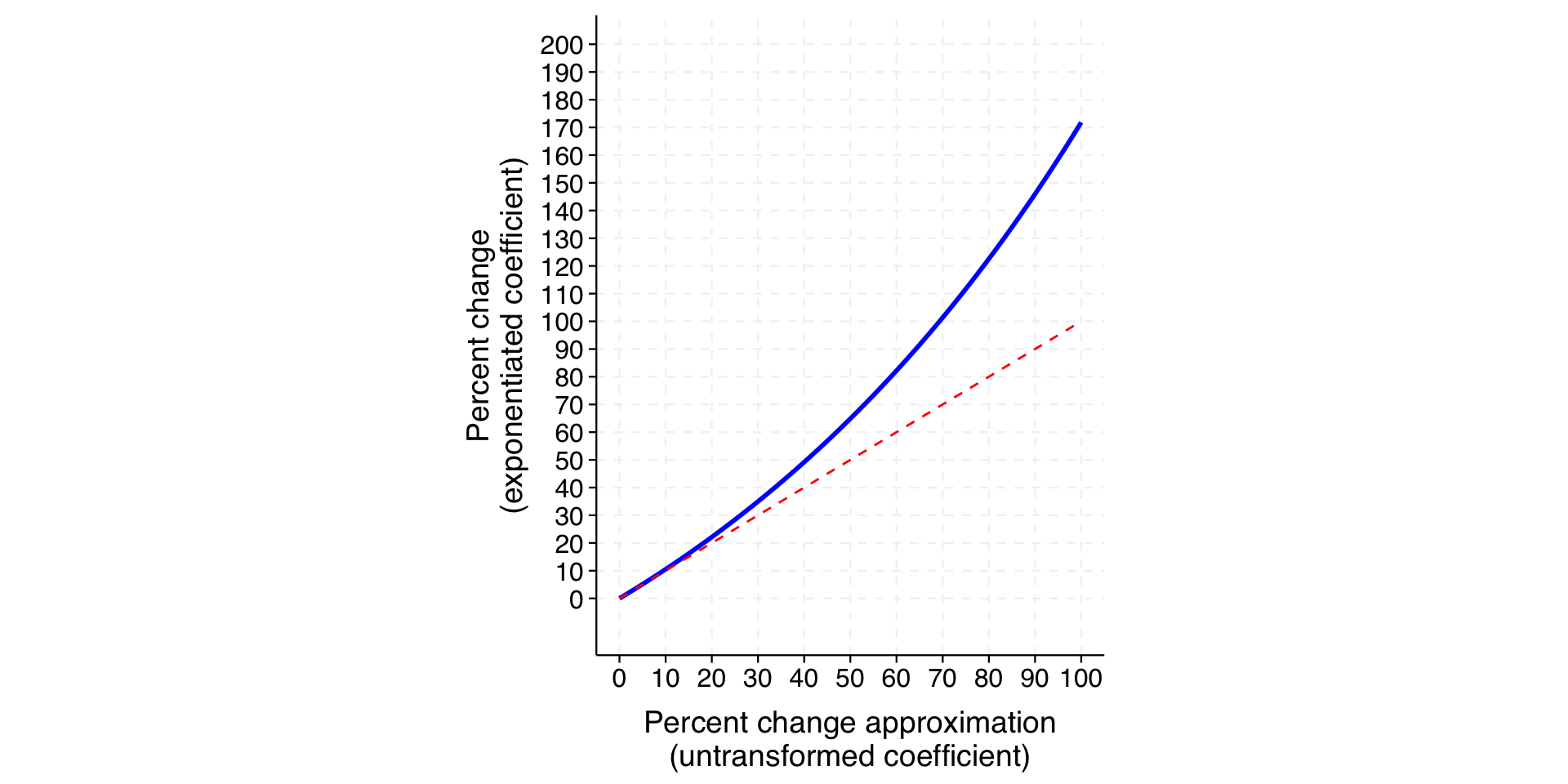
The blue line in the plot below shows the relationship between percent change (exponentiated coefficient) and the approximation provided by the untransformed coefficient. The red dashed line indicates where x and y are equal – i.e., where the approximation would be perfect.
We can see that the approximation is very close when the percentage change is under 10 percent (a coefficient of .1) but increasingly inaccurate thereafter. Specifically, the approximation understates the actual percent change.
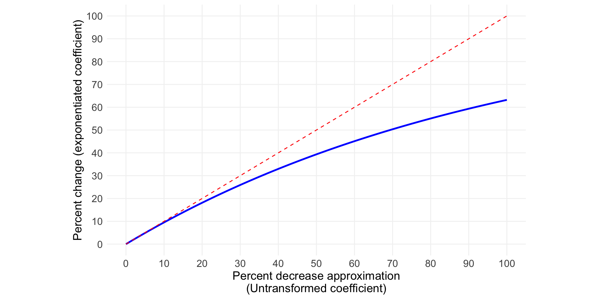
This is for the case in which the sign of the coefficient is positive. The plot below considers negative coefficients – that is, when the percent change is a decrease rather than an increase.
Here, the approximation again corresponds to what we get by exponentiation quite well when the value is 10 percent or less but becomes increasingly inaccurate thereafter. But, the divergence is in the opposite direction. When the coefficient is negative, interpreting the coefficient directly exaggerates the actual change. When the approximation says the decrease is 50%, for example, it is actually about 40%.
Aside: From economics, a multiplicative change in the outcome for a one-unit increase in the explanatory variable–as in our example of year here–is called a semi-elasticity. If a quantitative explanatory variable is also logged, the resulting coefficient is called an elasticity. An elasticity may be interpreted as the percent change in \(y\) associated with a 1% increase in \(x\). For example, if the coefficient was 2, that would indicate that a change in the explanatory variable of 1% is associated with a 2% change in the outcome. Unlike a semi-elasticity, the interpretation of an elasticity is not an approximation.
Multiplicative change in the outcome
As it turns out, for what the analyst is probably seeking to estimate, logging the outcome and then exponentiating the coefficient is itself an approximation.
Making the untransformed coefficient approach an approximation of an approximation!
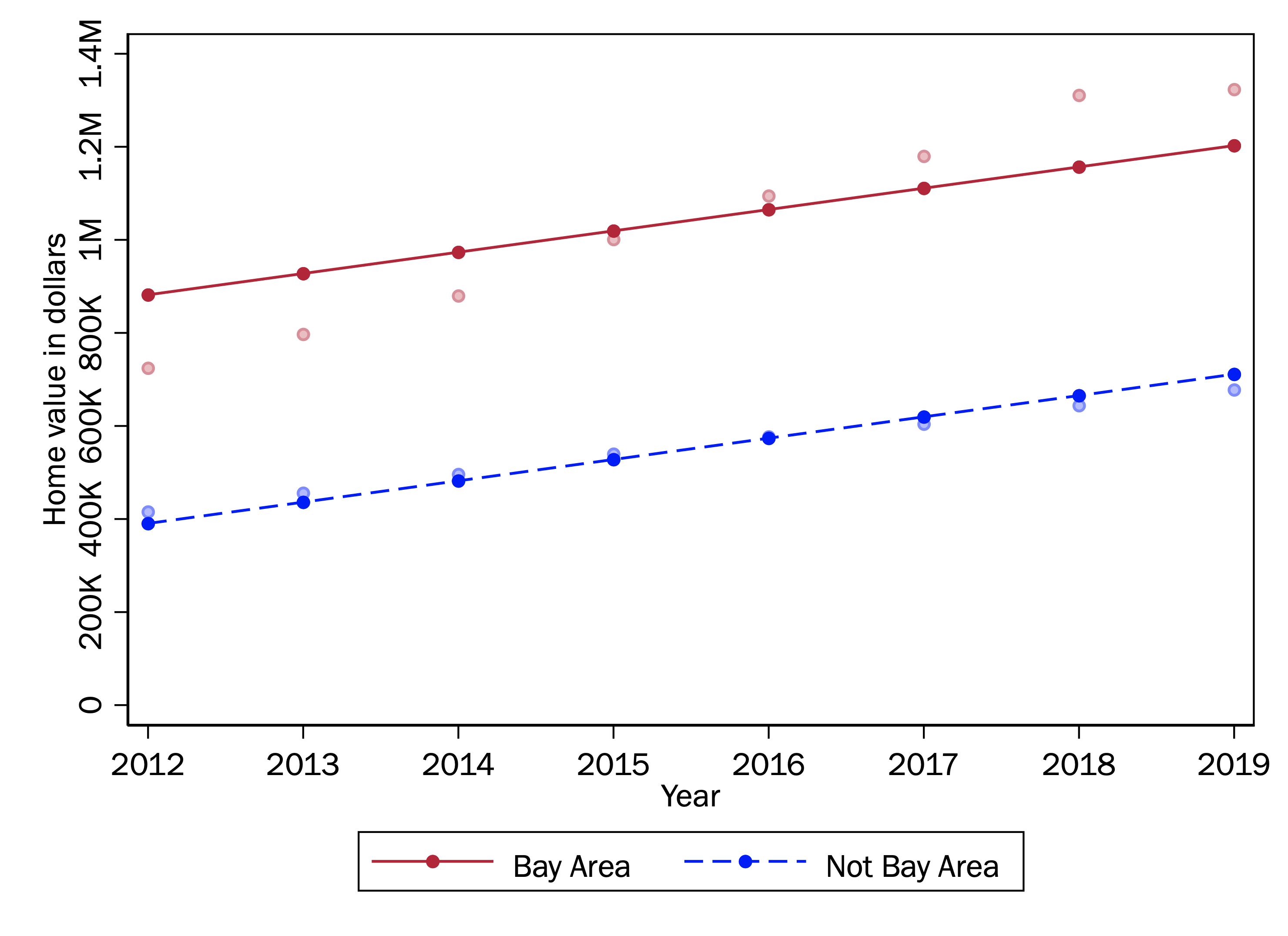
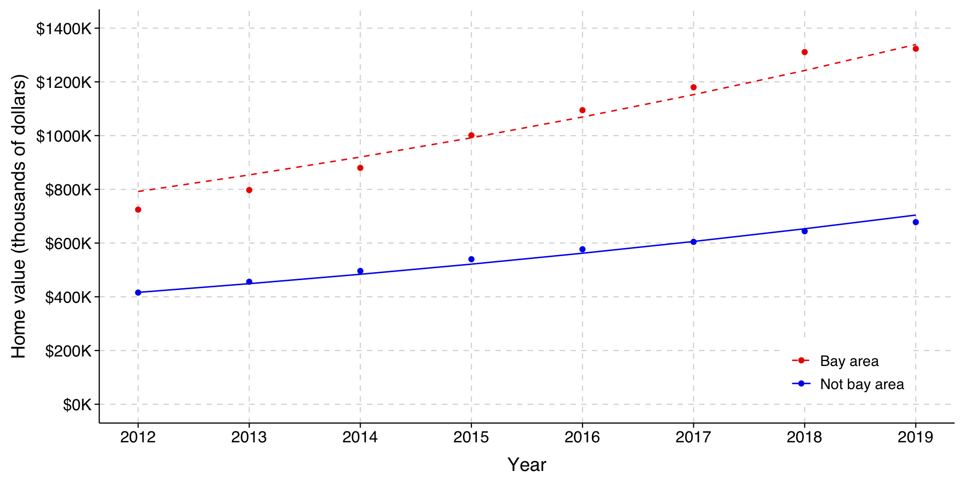
We can see how it is not quite right if we redraw the same graph, using the predictions from the logged outcome model and exponentiating them to convert back to dollars.
Expand for code that fits model and plots predictions
model <-lm(log(homevalue) ~ year + bayarea, data=homes)homes$xbeta = model$fitted.values values <- homes %>%group_by(bayarea, year) %>%# summarize(homevalue=mean(homevalue), xbeta=mean(exp(xbeta)))summarize(homevalue=mean(homevalue), xbeta=mean(exp(xbeta)))values$realyear = values$year +2000ggplot(data=values, aes(x=realyear, group=as_factor(bayarea), color=as_factor(bayarea), linetype=as_factor(bayarea))) +# Add linetype aestheticgeom_line(aes(y=xbeta)) +geom_point(aes(y=homevalue)) +# Fix the y-axis scale - use original values since it's not thousandsscale_y_continuous(breaks=seq(0, 1400000, 200000),labels=function(x) paste0("$", x/1000, "K") ) +expand_limits(y=c(0, 1400000)) +scale_x_continuous(breaks=seq(2012, 2019, 1),minor_breaks =NULL ) +# Set custom colors (red for Bay Area, blue for Not Bay Area)scale_color_manual(values =c("blue2", "red2")) +# Set custom line types (solid for Bay Area, dashed for Not Bay Area)scale_linetype_manual(values =c("solid", "dashed")) +guides(color =guide_legend(reverse=TRUE),linetype =guide_legend(reverse=TRUE)) +# Apply reverse to linetype tootheme_tula() +theme(legend.title =element_blank(),legend.position =c(0.95, 0.05),legend.justification =c(1, 0),legend.background =element_rect(fill ="white", color =NA),legend.text =element_text(size =11), ) +xlab("Year") +ylab("Home value (thousands of dollars)")
. quietly regress lnhomevalue year bayarea

. predict xbeta
(option xb assumed; fitted values)

. gen expxbeta = exp(xbeta)
As you can see, the lines no longer fit the observed means well at all; both prediction lines are well below the observed means. If we used these results to generate actual predictions about home values, we would miss the mark considerably.
Even so, we might notice that the lines themselves are not bad: if they were shifted upwards, they might even be a better fit than what we had before. Indeed, recall that we had a higher \(R^2\) in this model, which might seem very odd considering how far from the observed means these results are.
Ultimately, the source of mischief here is a simple math fact: the log of the mean of a variable is not the same as the mean of that variable logged. When we log a variable and then model the conditional mean of that logged variable, we are not quite modeling the log of the conditional mean of the variable itself.
We can model the log of the conditional mean in the linear regression framework, but we have to step outside the OLS framework to do it. While we will here sidestep details, we can model the logged conditional mean using the generalized linear model, which we have not covered yet but will.
For now, the important thing about the generalized linear model is that it allows you to specify the way that \(\mathbf{x}\mathbf{\beta}\) and the key parameter you are trying to model are linked.
Normally in linear regression, \(\mathbf{x}\mathbf{\beta} = \hat{y}\), so the link is just the identity link (identity in mathematics means that two things are the same). Here, because we are modeling the log of the outcome, \(\mathbf{x}\mathbf{\beta} = \ln(\hat{y})\), for a log link.
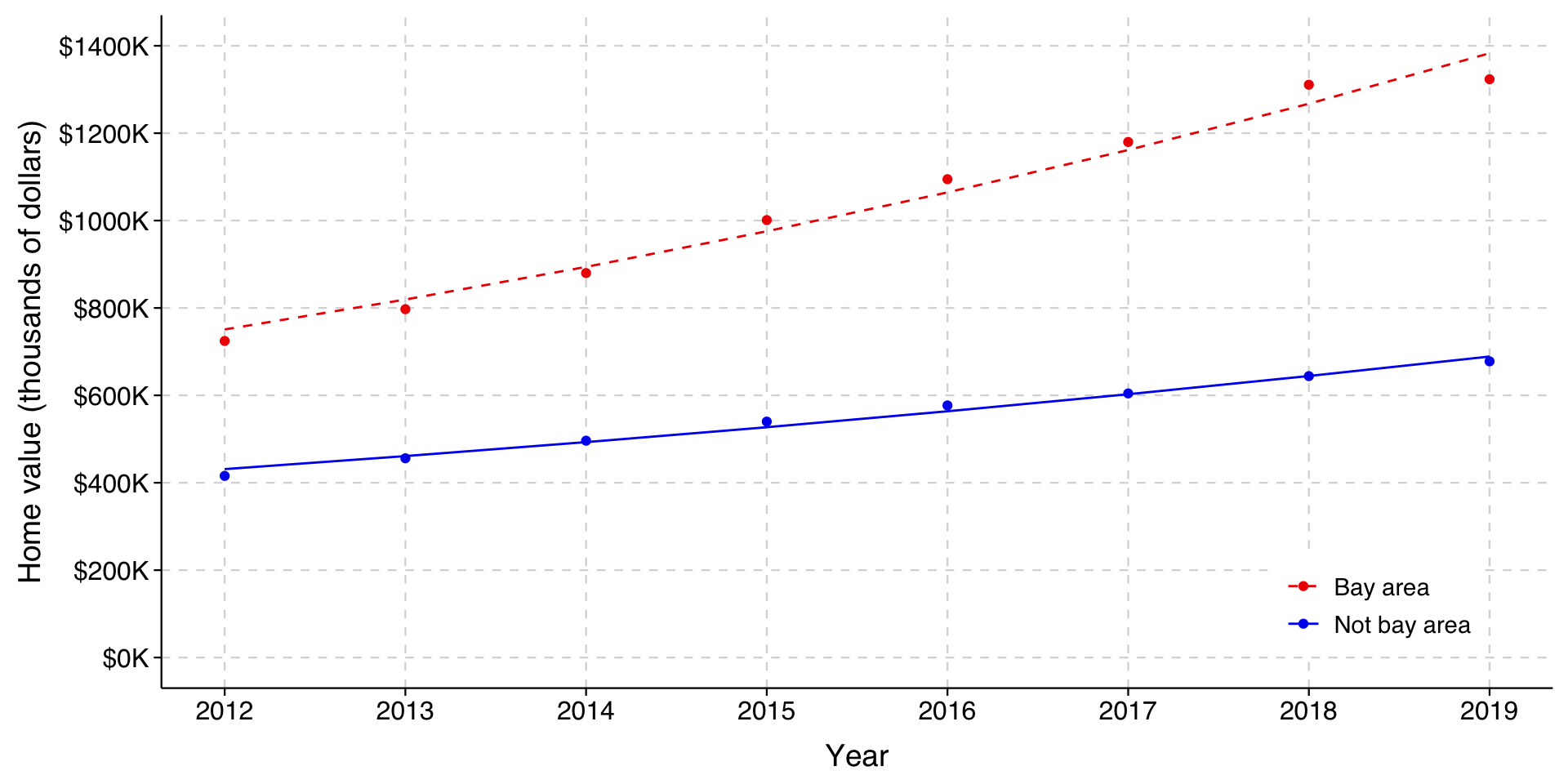
The predictions now track the observed means well, and clearly fit better than the additive model.
Aside: Looking at this graph, you may notice that it still doesn’t fit the Bay Area housing prices right, and that it is still the case that it is overestimating the prices in the early years and underestimating the price in later years. At this point the issue is that the appreciation of houses in the Bay Area was simply greater in percentage terms than it was for houses outside the Bay Area.
The coefficient for the interaction is significant, meaning that homes in the Bay Area did go up by a higher percentage than other homes. The year coefficient is \(.06692\) for homes outside the Bay Area and \(.06692 + .02033 = .08725\) for those in the Bay Area. Exponentiating these yields 1.0692 and 1.0912. We could interpret this as follows:
Over the period 2012-2019, houses in the Bay Area appreciated by 9.1% per year, compared to 6.9% for houses elsewhere in California.
And now our fit to the observed conditional means is very good: