Profile Plots of Predicted Probabilities

The logit model is nonlinear in the probabilities. Whenever you have a nonlinear relationship, plots provide the most effective way of conveying it. Here, we use a plot to show how predicted probabilities change as one explanatory variable changes, holding the others constant.

A plot that shows change in an outcome as an explanatory variable changes is called a profile plot.

Introducing our example

To illustrate profile plots, we will use data on the fourth-down decisions made in all top-division (FBS) college football games over six seasons (2014-2019). If you are not familiar with American football, a team that reaches fourth down without having gained ten yards has three choices:

  1. it can punt, giving possession to the other team;
  2. it can attempt a field goal, to score 3 points instead of the 7 that a touchdown usually yields, or
  3. it can go for it by trying to gain the yards they need to get a new set of downs and keep going.

Various situational factors influence whether a team decides to go for it, but an obvious one is how many yards they need to get: the fewer yards needed, the more likely to go for it. But how much more likely?

In this example:

  • Our outcome is a binary variable indicating whether the team goes for it.
  • Our key explanatory variable is the number of yards needed.
  • Covariates are:
    • How far the team is from scoring a touchdown (\(\mathtt{yds\_to\_td}\))
    • Whether the team is ahead, tied, or behind (\(\mathtt{score\_is}\))
    • What quarter it is, or whether the game is in overtime (\(\mathtt{gametime}\))

Let’s fit the model:

Expand for data preparation commands
# dependencies
library(tidyverse)
library(haven)
library(marginaleffects)
library(tulaverse)
library(gridExtra) # for combining plots below

df <- read_dta("../dta/cfb_fourthdown.dta")

df <- df %>%
  mutate(score_is = as_factor(score_is)) %>%
  mutate(score_is = relevel(score_is, ref="tied")) %>%
  mutate(gametime = as_factor(gametime)) %>%
  mutate(gametime = fct_recode(gametime,
                      "Q1" = "1st Q",
                      "Q2" = "2nd Q",
                      "Q3" = "3rd Q",
                      "Q4" = "4th Q",
                      "OT" = "Overtime")) 
model <- glm(goforit ~ yds_needed + yds_to_td + score_is + gametime, 
             data=df, 
             family="binomial")

tula(model)
Family: binomial / Link: logit
AIC            =  58787.222                          Number of obs   =  80887
BIC            =  58870.929                          McFadden R-sq   = 0.2452
Log likelihood = -29384.611                          Nagelkerke R-sq = 0.3402
─────────────────────────────────────────────────────────────────────────────
goforit     │      Coef  Std. Err.          z     P>|z|  [95% Conf  Interval]
─────────────────────────────────────────────────────────────────────────────
yds_needed  │    -.2136    .002935     -72.78    <.0001     -.2194     -.2079
yds_to_td   │    -.0326   .0004698     -69.39    <.0001    -.03352    -.03168
score_is    │                                                                
  ahead     │    -.7973     .03756     -21.23    <.0001     -.8709     -.7236
  behind    │     .4748     .03484      13.63    <.0001      .4065      .5431
gametime    │                                                                
  Q2        │     .1733     .03314      5.228    <.0001      .1083      .2382
  Q3        │     .3235     .03477      9.305    <.0001      .2554      .3916
  Q4        │     1.412     .03214      43.94    <.0001      1.349      1.475
  OT        │     .6326      .1468       4.31    <.0001      .3449      .9203
(Intercept) │     .7901     .03986      19.82    <.0001      .7119      .8682
─────────────────────────────────────────────────────────────────────────────
. logit goforit yds_needed yds_to_td ib2.score_is i.gametime, allbaselevels

Iteration 0:  Log likelihood = -38930.949  
Iteration 1:  Log likelihood = -30857.535  
Iteration 2:  Log likelihood = -29404.125  
Iteration 3:  Log likelihood = -29384.624  
Iteration 4:  Log likelihood = -29384.611  
Iteration 5:  Log likelihood = -29384.611  

Logistic regression                                   Number of obs =   80,887
                                                      LR chi2(8)    = 19092.68
                                                      Prob > chi2   =   0.0000
Log likelihood = -29384.611                           Pseudo R2     =   0.2452

------------------------------------------------------------------------------
     goforit | Coefficient  Std. err.      z    P>|z|     [95% conf. interval]
-------------+----------------------------------------------------------------
  yds_needed |  -.2136345   .0029355   -72.78   0.000     -.219388   -.2078811
   yds_to_td |  -.0325982   .0004698   -69.39   0.000    -.0335191   -.0316774
             |
    score_is |
      ahead  |   -.797253   .0375551   -21.23   0.000    -.8708595   -.7236464
       tied  |          0  (base)
     behind  |   .4748329   .0348414    13.63   0.000     .4065449    .5431209
             |
    gametime |
      1st Q  |          0  (base)
      2nd Q  |   .1732506    .033136     5.23   0.000     .1083053     .238196
      3rd Q  |   .3235063   .0347662     9.31   0.000     .2553659    .3916467
      4th Q  |   1.411995   .0321368    43.94   0.000     1.349008    1.474982
   Overtime  |   .6326339   .1467848     4.31   0.000      .344941    .9203268
             |
       _cons |   .7900719   .0398613    19.82   0.000     .7119451    .8681987
------------------------------------------------------------------------------

Qualitatively, these coefficients indicate that, net of one another, teams are more likely to go for it when - they need fewer yards for a first down - they need fewer yards for a touchdown - they are behind, or - it is the fourth quarter or overtime.

Mean predicted probability or predicted probability at the mean?

The clearest way to visualize how predicted probabilities change as an explanatory variable changes is to draw a plot.

But, whenever we generate predictions, those predictions depend on the values of all the explanatory variables, not just the one that we are currently focusing on. So in order to draw a graph of predicted probabilities given model estimates, we have to make a decision about the value of the other variables.

In practice, there are two main options:

  1. Probability at the mean. Compute the predicted probability holding the other variables to their respective means. For categorical variables, this means that each level of the categorical variable will be held to its proportion in the sample.
  2. Mean probability. Compute predicted probabilities for each of our observations, using its values for the other explanatory variables, and then take the mean of all those predicted probabilities.

These do not give the same answer–although for this purpose they are often close–and there is no blanket recommendation about which you should use.

As a practical matter using the marginaleffects package in R, once categorical variables are involved, it is easier to compute the mean probabilities because one does not have to re-fit the model with a dummy variable specification (as I showed before).

In this example, I am going to use the mean probability.

Skippable: Why did I choose to use the mean probability? For this application, talking in terms of the mean probability makes sense to me because it is easy to think about averaging over all the scenarios implied by the other covariates, while the distance to the first down varies. That is, it is easy for me to imagine that, for any of the observed situations in terms of the other covariates, teams might be facing a 4th-and-1 or a 4th-and-15, etc. in that situation.

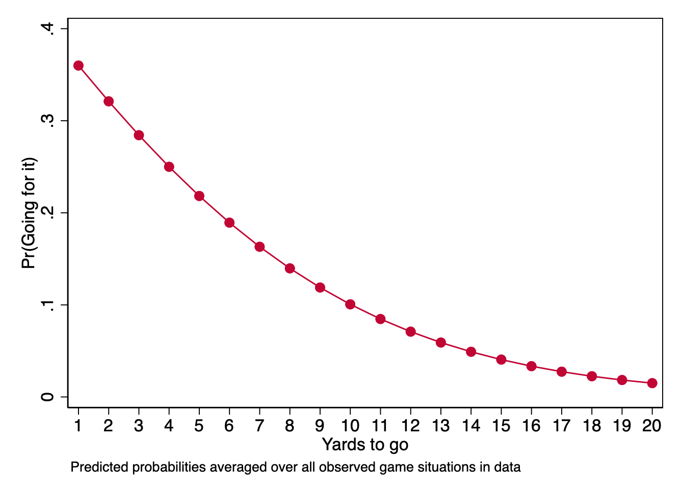
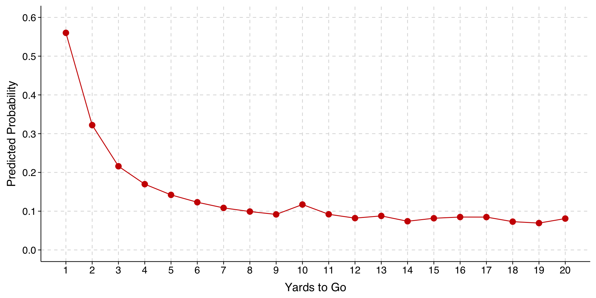
For the plot, then, we are going to compute the mean predicted probability for different values of our key explanatory variable (1-20 yards), averaging over all the observed configurations of location on the field, time in the game, and whether the team on offense is ahead or behind.

In R, we will first use the avg_predictions() from marginaleffects to generate the predictions that we want to plot. We will store these predictions in an object toplot.

toplot <- avg_predictions(model,
                variables = list("yds_needed" = seq(1, 20, 1)))

Then, we will draw the plot:

ggplot(toplot, aes(x = yds_needed, y = estimate)) +
  geom_line(color = "red3") +
  geom_point(color = "red3", size = 3, shape = 21, fill = "red3") + 
  scale_y_continuous(limits = c(0, 0.4)) +
  scale_x_continuous(limits = c(1, 20), 
                     breaks = seq(1, 20, 1),
                     minor_breaks = NULL) +
  labs(
    x = "Yards to go",
    y = "Predicted Probability"
  ) +
  theme_tula()

In Stata, making a plot starts with using the \(\texttt{margins}\) command after we fit our model.

. margins, at(yds_needed=(1(1)20)) noatlegend

Predictive margins                                      Number of obs = 80,887
Model VCE: OIM

Expression: Pr(goforit), predict()

------------------------------------------------------------------------------
             |            Delta-method
             |     Margin   std. err.      z    P>|z|     [95% conf. interval]
-------------+----------------------------------------------------------------
         _at |
          1  |   .3599856   .0029748   121.01   0.000     .3541551    .3658161
          2  |   .3210738   .0024574   130.65   0.000     .3162573    .3258903
          3  |   .2843147   .0020207   140.70   0.000     .2803542    .2882753
          4  |   .2499863   .0016912   147.81   0.000     .2466716    .2533011
          5  |   .2182825   .0014839   147.10   0.000      .215374    .2211909
          6  |   .1893153   .0013892   136.27   0.000     .1865925    .1920382
          7  |   .1631212    .001372   118.90   0.000     .1604322    .1658103
          8  |   .1396692   .0013894   100.53   0.000      .136946    .1423923
          9  |   .1188713    .001409    84.36   0.000     .1161097     .121633
         10  |   .1005943   .0014127    71.20   0.000     .0978254    .1033633
         11  |   .0846709   .0013934    60.77   0.000       .08194    .0874019
         12  |   .0709111   .0013504    52.51   0.000     .0682644    .0735577
         13  |    .059112   .0012867    45.94   0.000     .0565901    .0616338
         14  |   .0490667   .0012069    40.66   0.000     .0467013    .0514322
         15  |   .0405716   .0011161    36.35   0.000     .0383842    .0427591
         16  |   .0334314    .001019    32.81   0.000     .0314342    .0354285
         17  |   .0274633   .0009198    29.86   0.000     .0256605    .0292661
         18  |   .0224999   .0008219    27.37   0.000     .0208889    .0241109
         19  |   .0183906    .000728    25.26   0.000     .0169638    .0198174
         20  |   .0150016   .0006397    23.45   0.000     .0137478    .0162553
------------------------------------------------------------------------------

\(\texttt{margins}\) is a very powerful and flexible Stata command and we will get into its intricacies only on an as needed basis. Above, we have used \(\mathtt{at()}\) to specify the values of the key explanatory variable over which we want margins to compute different predictions.

As you can see, the results are numbered. I specified the \(\mathtt{noatlegend}\) option, or else the output would have provided an \(\mathtt{\_at}\) legend indicating what each result is. But result #1 corresponds to the case in which \(\mathtt{yds\_needed}\) equals 1, and result #20 corresponds to the case in which \(\mathtt{yds\_needed}\) equals 20.

The go-to way for drawing a plot from \(\texttt{margins}\) results is to use the \(\mathtt{marginsplot}\) command.

. marginsplot, noci xtitle("Yards to go") ///
>         ytitle("Pr(Going for it)") title("") ///
>         plotopts(mcolor(cranberry) lcolor(cranberry)) ///
>         note("Predicted probabilities averaged over all observed game situations in data")

Profile plot by levels of another explanatory variable

One idea in college and pro football is that coaches do not decide to go for it as often as they should, because it is the risky option that looks worse for them when it doesn’t work out. However, as analytics have become increasingly prominent in sports, the idea that coaches should go for it more often is well-known. So maybe coaches have come to appreciate that they have a better chance of winning by taking more risks on fourth down, or maybe not going for it has become risky in its own right now that so many journalists and fans have heard that coaches punt too much.

Either way, one might hypothesize that coaches are becoming more willing to go for it on fourth down.

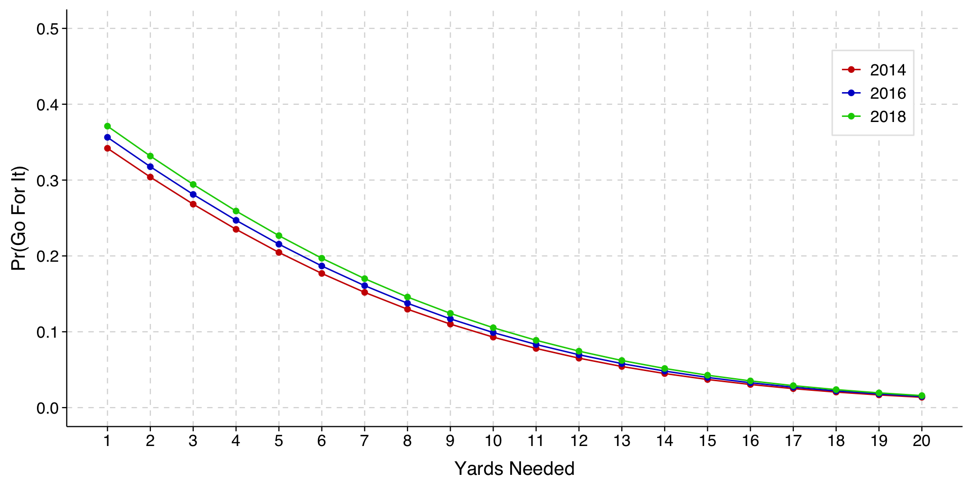
To test this hypothesis, we will add an explanatory variable for the year the game was played (year).

First, we refit the model adding a term for year:

model2 <- glm(goforit ~ year + yds_needed + yds_to_td + score_is + gametime, 
             data=df, 
             family="binomial")

tula(model2)
Family: binomial / Link: logit
AIC            =  58747.849                          Number of obs   =  80887
BIC            =  58840.857                          McFadden R-sq   = 0.2457
Log likelihood = -29363.924                          Nagelkerke R-sq = 0.3408
─────────────────────────────────────────────────────────────────────────────
goforit     │      Coef  Std. Err.          z     P>|z|  [95% Conf  Interval]
─────────────────────────────────────────────────────────────────────────────
year        │    .03928     .00611      6.429    <.0001      .0273     .05125
yds_needed  │    -.2138    .002937     -72.79    <.0001     -.2196      -.208
yds_to_td   │   -.03262     .00047     -69.39    <.0001    -.03354    -.03169
score_is    │                                                                
  ahead     │    -.7979     .03757     -21.24    <.0001     -.8716     -.7243
  behind    │     .4737     .03486      13.59    <.0001      .4053       .542
gametime    │                                                                
  Q2        │      .173     .03315      5.219    <.0001       .108       .238
  Q3        │     .3245     .03478       9.33    <.0001      .2564      .3927
  Q4        │     1.413     .03215      43.95    <.0001       1.35      1.476
  OT        │     .6369      .1467      4.341    <.0001      .3493      .9245
(Intercept) │    -78.41      12.32     -6.365    <.0001     -102.6     -54.27
─────────────────────────────────────────────────────────────────────────────

Then, we use avg_predictions() to generate predictions for the combination of values of yds_needed and year:

toplot <- avg_predictions(model2,
                variables = c(list("yds_needed" = seq(1, 20, 1)), list("year" = seq(2014, 2018, 2)))
                )

Finally, we draw our plot:

Expand to show code that draws plot
plot <- ggplot(toplot, aes(x = yds_needed, y = estimate, color = as.factor(year), fill = as.factor(year))) +
  geom_line() +
  geom_point(size = 1, shape = 21, stroke = 1) + 
  scale_color_manual(values = c("red3", "blue3", "green3"), name = NULL) +
  scale_fill_manual(values = c("red3", "blue3", "green3"), name = NULL) +
  scale_y_continuous(limits = c(0, 0.5)) +
  scale_x_continuous(limits = c(1, 20), 
                     breaks = seq(1, 20, 1),
                     minor_breaks = NULL) +
  labs(
    x = "Yards Needed",
    y = "Pr(Go For It)"
  ) +
  theme_tula() +
  theme(
    legend.position = c(.9, .8),
    legend.background = element_rect(fill = "white", color = "gray90", linewidth = 0.5, linetype = "solid"),
    panel.grid.minor = element_blank()
  )

plot

. logit goforit yds_needed yds_to_td ib2.score_is i.gametime year, allbaselevels

Iteration 0:  Log likelihood = -38930.949  
Iteration 1:  Log likelihood = -30842.081  
Iteration 2:  Log likelihood = -29383.602  
Iteration 3:  Log likelihood = -29363.938  
Iteration 4:  Log likelihood = -29363.924  
Iteration 5:  Log likelihood = -29363.924  

Logistic regression                                   Number of obs =   80,887
                                                      LR chi2(9)    = 19134.05
                                                      Prob > chi2   =   0.0000
Log likelihood = -29363.924                           Pseudo R2     =   0.2457

------------------------------------------------------------------------------
     goforit | Coefficient  Std. err.      z    P>|z|     [95% conf. interval]
-------------+----------------------------------------------------------------
  yds_needed |  -.2137983   .0029372   -72.79   0.000    -.2195551   -.2080415
   yds_to_td |  -.0326161     .00047   -69.39   0.000    -.0335373   -.0316948
             |
    score_is |
      ahead  |  -.7979337   .0375731   -21.24   0.000    -.8715756   -.7242917
       tied  |          0  (base)
     behind  |   .4736754   .0348637    13.59   0.000     .4053438     .542007
             |
    gametime |
      1st Q  |          0  (base)
      2nd Q  |   .1730133   .0331512     5.22   0.000     .1080382    .2379885
      3rd Q  |   .3245455   .0347836     9.33   0.000     .2563709    .3927201
      4th Q  |   1.413023   .0321534    43.95   0.000     1.350004    1.476043
   Overtime  |   .6369026   .1467328     4.34   0.000     .3493116    .9244935
             |
        year |   .0392787   .0061097     6.43   0.000      .027304    .0512534
       _cons |  -78.41379   12.31989    -6.36   0.000    -102.5603   -54.26726
------------------------------------------------------------------------------

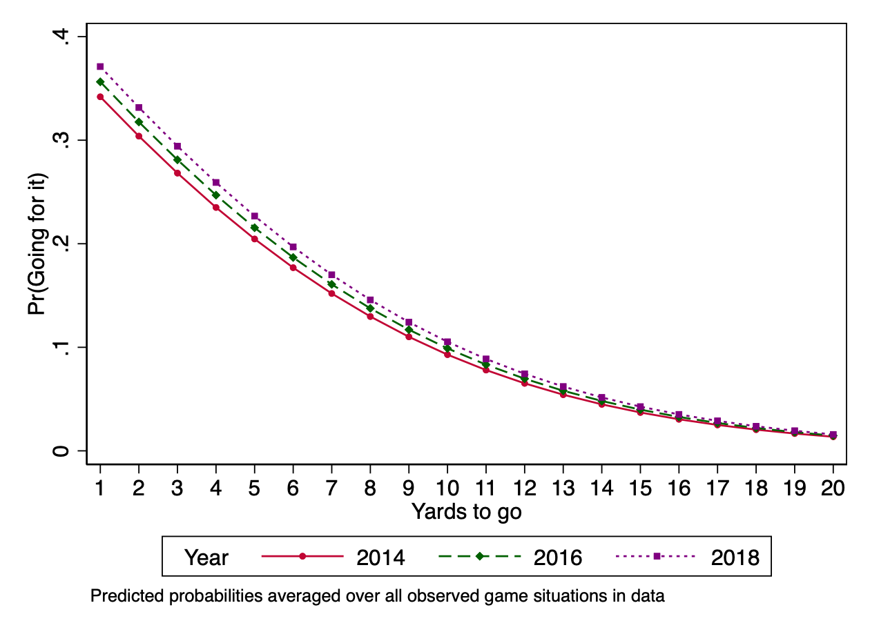
The highlighted result shows that teams were indeed more likely to go for it in more recent years. To visualize how much, we can draw a profile plot with different lines for different years.

Nonlinearities are not interactions

In the profile plot above, the different lines are just parallel logit curves. That is, they are the same curve just shifted to the left or right.

When we see the difference between years being larger when there are fewer yards to go, we want to recognize that this is a feature of parallel logit curves for the predicted probabilities in question. We are not saying that there is an interaction effect of yardage and year beyond this.

This is important to recognize when you see these plots in papers. Plots can show patterns that look more well-behaved than the underlying data. For example, a possible reality would be one in which coaches in recent years have become more likely to go for it on fourth down when there are few yards to go, but less likely to go for it on fourth-and-long. Such a pattern would only become visible if we include an interaction term in the model. Absent such a term, the curves will be parallel in the plot even if in reality they should not be.

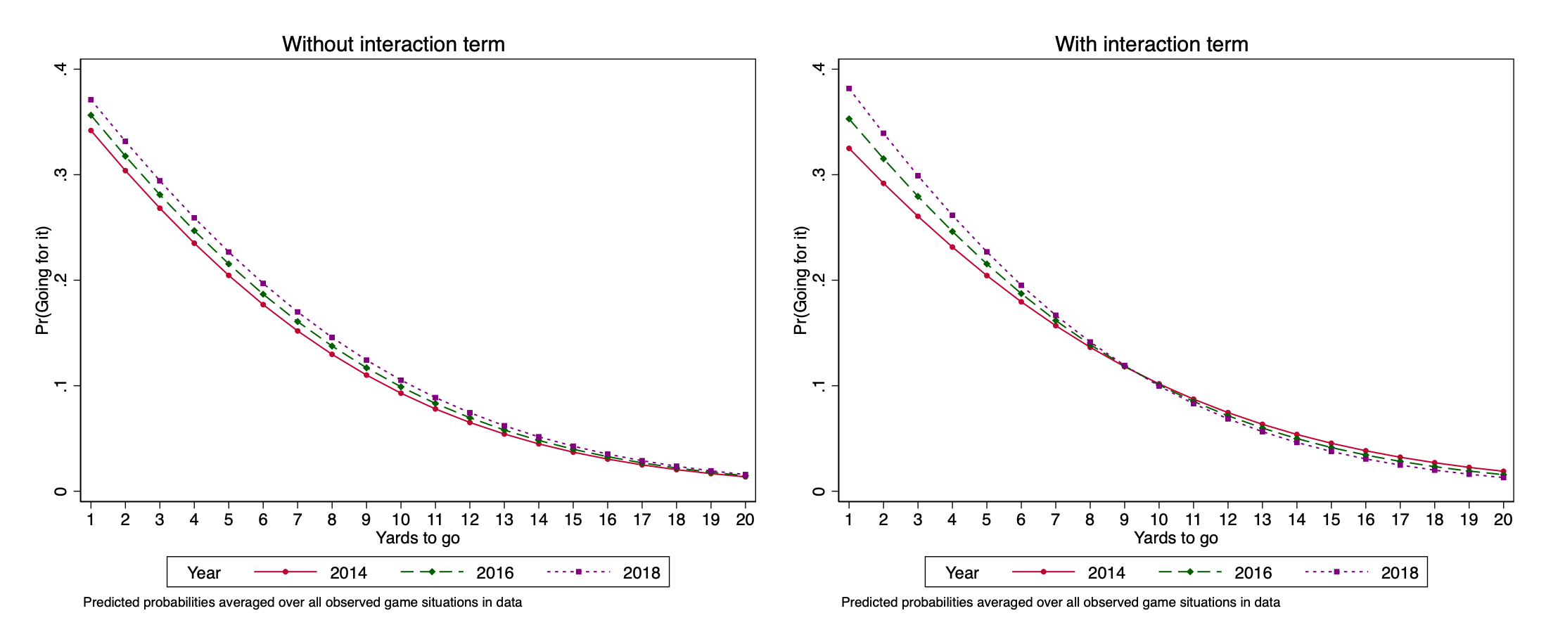
If we want to consider the possibility that these curves may not be parallel, we can model the interaction term explicitly.

Including and plotting an interaction term

When fitting interactions that involve a continuous explanatory variable, you will want either to center the variable (so that 0 = its mean) or otherwise have the variable scaled so that 0 is a meaningful value in the range of the data. We will create a variable year_min_2016 that is year - 2016, and then we will use this to fit an interaction with the yds_needed variable.

df <- df %>%
  mutate(year_min_2016 = year - 2016)

model3 <- glm(goforit ~ (year_min_2016 * yds_needed) + yds_to_td + score_is + gametime, 
             data=df, 
             family="binomial")
tula(model3)
Family: binomial / Link: logit
AIC            =  58719.999                             Number of obs   =  80887
BIC            =  58822.308                             McFadden R-sq   = 0.2461
Log likelihood = -29348.999                             Nagelkerke R-sq = 0.3413
────────────────────────────────────────────────────────────────────────────────
goforit        │      Coef  Std. Err.          z     P>|z|  [95% Conf  Interval]
────────────────────────────────────────────────────────────────────────────────
year_min_2016  │    .08604     .01052      8.178    <.0001     .06542      .1067
yds_needed     │    -.2093    .003026     -69.16    <.0001     -.2152     -.2033
yds_to_td      │   -.03264   .0004703     -69.42    <.0001    -.03357    -.03172
score_is       │                                                                
  ahead        │    -.7973     .03759     -21.21    <.0001      -.871     -.7237
  behind       │     .4748     .03488      13.61    <.0001      .4065      .5432
gametime       │                                                                
  Q2           │     .1733     .03317      5.226    <.0001      .1083      .2383
  Q3           │     .3251      .0348      9.342    <.0001      .2569      .3933
  Q4           │     1.414     .03217      43.95    <.0001      1.351      1.477
  OT           │     .6385      .1467      4.353    <.0001       .351       .926
year~needed    │  -.009234     .00169     -5.465    <.0001    -.01255   -.005922
(Intercept)    │      .749     .04019      18.63    <.0001      .6702      .8278
────────────────────────────────────────────────────────────────────────────────

The interaction term (the last coefficient listed) is statistically significant. We can plot this interaction.

Expand to show code that draws plot
# note the cross-classification in variables argument to plot two variables together
toplot <- avg_predictions(model3,
                variables = c(list("yds_needed" = seq(1, 20, 1)), list("year_min_2016" = seq(-2, 2, 2)))
                ) %>%
  mutate(year = year_min_2016 + 2016) # create year variable so plot will indicate year rather than year_min_2016

plot_w_interaction <- ggplot(toplot, aes(x = yds_needed, y = estimate, color = as.factor(year), fill = as.factor(year))) +
  geom_line() +
  geom_point(size = 1, shape = 21, stroke = 1) + 
  scale_color_manual(values = c("red3", "blue3", "green3"), name = NULL) +
  scale_fill_manual(values = c("red3", "blue3", "green3"), name = NULL) +
  scale_y_continuous(limits = c(0, 0.5)) +
  scale_x_continuous(limits = c(1, 20), 
                     breaks = seq(1, 20, 1),
                     minor_breaks = NULL) +
  labs(
    x = "Yards Needed",
    y = "Pr(Go For It)"
  ) +
  theme_tula() +
  theme(
    legend.position = c(.9, .8),
    legend.background = element_rect(fill = "white", color = "gray90", linewidth = 0.5, linetype = "solid"),
    panel.grid.minor = element_blank()
  )

plot_w_interaction

We will show the plot alongside the earlier plot for the model without the interaction term so you can see the difference.

Expand to show code for combining plots
plot <- plot + 
    theme(legend.position = c(.8, .8)) + 
    ggtitle("Without interaction term") +
    theme(plot.title = element_text(hjust = 0.5)) 

plot_w_interaction <- plot_w_interaction +
    theme(legend.position = c(.8, .8)) + 
    ggtitle("With interaction term") +
    theme(plot.title = element_text(hjust = 0.5)) 

grid.arrange(plot, plot_w_interaction, ncol=1)

. gen yeartrans = year - 2016

. logit goforit c.yds_needed##c.yeartrans yds_to_td ib2.score_is i.gametime , allbaselevels

Iteration 0:   log likelihood = -38930.949  
Iteration 1:   log likelihood = -30827.596  
Iteration 2:   log likelihood = -29368.791  
Iteration 3:   log likelihood = -29349.013  
Iteration 4:   log likelihood = -29348.999  
Iteration 5:   log likelihood = -29348.999  

Logistic regression                             Number of obs     =     80,887
                                                LR chi2(10)       =   19163.90
                                                Prob > chi2       =     0.0000
Log likelihood = -29348.999                     Pseudo R2         =     0.2461

------------------------------------------------------------------------------------------
                 goforit |      Coef.   Std. Err.      z    P>|z|     [95% Conf. Interval]
-------------------------+----------------------------------------------------------------
              yds_needed |    -.20927   .0030258   -69.16   0.000    -.2152004   -.2033395
               yeartrans |   .0860424   .0105217     8.18   0.000     .0654202    .1066646
                         |
c.yds_needed#c.yeartrans |  -.0092335   .0016897    -5.46   0.000    -.0125453   -.0059217
                         |
               yds_to_td |  -.0326448   .0004703   -69.42   0.000    -.0335665   -.0317231
                         |
                score_is |
                  ahead  |  -.7973293   .0375861   -21.21   0.000    -.8709967    -.723662
                   tied  |          0  (base)
                 behind  |   .4748244   .0348775    13.61   0.000     .4064658    .5431831
                         |
                gametime |
                  1st Q  |          0  (base)
                  2nd Q  |   .1733316   .0331669     5.23   0.000     .1083257    .2383375
                  3rd Q  |     .32512   .0348015     9.34   0.000     .2569102    .3933298
                  4th Q  |   1.413813   .0321667    43.95   0.000     1.350767    1.476859
               Overtime  |   .6385262   .1466908     4.35   0.000     .3510176    .9260348
                         |
                   _cons |   .7490065   .0401942    18.63   0.000     .6702273    .8277856
------------------------------------------------------------------------------------------

The interaction term (highlighted) is statistically significant. We can plot this interaction. We will show the plot alongside the earlier plot for the model without the interaction term so you can see the difference:


Stata note: If we use Stata’s factor variable syntax when specifying the interaction (example: \(\mathtt{c.yds\_needed\#\#c.yeartrans}\)), \(\mathtt{margins}\) and \(\mathtt{marginsplot}\) will handle the interaction properly and automatically when computing the predictions. I strongly urge you to do this when including interaction terms in your model.

The plots show that the difference over time in choices in short-yardage situations is even larger when we include the interaction term.

Aside for folks who know football: Substantively, this part makes sense. Decisions to go for it on fourth-and-long are typically matters of desperation: the main situation where teams do it is when they are behind late in the game. Analytics have had no argument with conventional coaching wisdom about that.

Instead, where analytics have called conventional coaching decisions into question is about fourth-and-short, and so it is not surprising that once we let the curves be non-parallel, we see bigger differences for shorter yardage.

Nonlinear nonlinearities

When we add the interaction term, we are still drawing regular logit curves for a continuous explanatory variable; we are just allowing the curves not to be parallel. That is, we are still assuming that the relationship between distance and fourth-down-decision is linear in the logit, even though with the interaction terms we are allowing the slope of that relationship to differ by year.

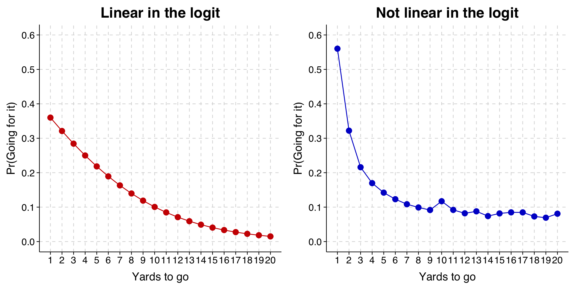
A different possibility is that we want to relax the assumption that the relationship between yards-needed and fourth-down-decisions is linear in the logit. Given that yards needed is measured as an integer, the most flexible way to do this is to treat it like it was a categorical variable in our model, so that there is a different coefficient for every distance value.

We will also recode values of yds_needed that are larger than 20 to 20 so that we don’t have any problems with too few cases.

Expand to show code that recodes variable and fits model
df <- df %>%
  mutate(yds_needed_max20 = ifelse(yds_needed > 20, 20, yds_needed))

model4 <- glm(goforit ~ as_factor(yds_needed_max20) + yds_to_td + score_is + gametime, 
             data=df, 
             family="binomial")

tula(model4)
Family: binomial / Link: logit
AIC            =  54640.644                             Number of obs   =  80887
BIC            =  54891.766                             McFadden R-sq   = 0.2989
Log likelihood = -27293.322                             Nagelkerke R-sq = 0.4045
────────────────────────────────────────────────────────────────────────────────
goforit        │      Coef  Std. Err.          z     P>|z|  [95% Conf  Interval]
────────────────────────────────────────────────────────────────────────────────
as~max20)      │                                                                
  2            │     -1.26      .0399     -31.57    <.0001     -1.338     -1.181
  3            │    -1.945     .04254     -45.73    <.0001     -2.029     -1.862
  4            │    -2.311     .04531     -51.02    <.0001       -2.4     -2.223
  5            │    -2.565     .04683     -54.77    <.0001     -2.657     -2.473
  6            │    -2.762     .04924     -56.08    <.0001     -2.858     -2.665
  7            │     -2.93     .05319     -55.07    <.0001     -3.034     -2.825
  8            │    -3.048     .05628     -54.16    <.0001     -3.158     -2.937
  9            │    -3.146     .06189     -50.84    <.0001     -3.268     -3.025
  10           │    -2.828     .05168     -54.72    <.0001     -2.929     -2.726
  11           │    -3.142     .07503     -41.88    <.0001     -3.289     -2.995
  12           │    -3.285     .08521     -38.56    <.0001     -3.452     -3.118
  13           │    -3.201     .09114     -35.12    <.0001      -3.38     -3.023
  14           │    -3.413      .1028     -33.19    <.0001     -3.614     -3.211
  15           │     -3.29      .1005     -32.75    <.0001     -3.487     -3.093
  16           │    -3.244        .11      -29.5    <.0001     -3.459     -3.028
  17           │    -3.245      .1212     -26.78    <.0001     -3.483     -3.008
  18           │     -3.43      .1406      -24.4    <.0001     -3.705     -3.154
  19           │    -3.493      .1628     -21.45    <.0001     -3.812     -3.174
  20           │    -3.303      .0782     -42.23    <.0001     -3.456     -3.149
yds_to_td      │   -.03643   .0005047     -72.18    <.0001    -.03742    -.03544
score_is       │                                                                
  ahead        │    -.7804     .04018     -19.42    <.0001     -.8591     -.7016
  behind       │     .5941     .03748      15.85    <.0001      .5207      .6676
gametime       │                                                                
  Q2           │       .17     .03537      4.806    <.0001      .1007      .2393
  Q3           │     .3413     .03704      9.215    <.0001      .2687      .4139
  Q4           │       1.5     .03426      43.79    <.0001      1.433      1.567
  OT           │      .702      .1516      4.632    <.0001       .405      .9991
(Intercept)    │     1.709     .04664      36.64    <.0001      1.617        1.8
────────────────────────────────────────────────────────────────────────────────
Expand to show code to generate predictions
toplot <- avg_predictions(model4,
                variables = c(list("yds_needed_max20" = seq(1, 20, 1)))
                )
Expand to show code to generate plot
ggplot(toplot, aes(x = yds_needed_max20, y = estimate)) +
  geom_line(color = "red3") +
  geom_point(color = "red3", size = 3, shape = 21, fill = "red3") + 
  scale_y_continuous(limits = c(0, 0.6), breaks = seq(0, .6, .1)) +
  scale_x_continuous(limits = c(1, 20), 
                     breaks = seq(1, 20, 1),
                     minor_breaks = NULL) +
  labs(
    x = "Yards to Go",
    y = "Predicted Probability"
  ) +
  theme_tula()

. logit goforit i.yds_needed2 yds_to_td ib2.score_is i.gametime, allbaselevels

Iteration 0:   log likelihood = -38930.949  
Iteration 1:   log likelihood = -28825.257  
Iteration 2:   log likelihood = -27345.628  
Iteration 3:   log likelihood = -27293.467  
Iteration 4:   log likelihood = -27293.322  
Iteration 5:   log likelihood = -27293.322  

Logistic regression                             Number of obs     =     80,887
                                                LR chi2(26)       =   23275.25
                                                Prob > chi2       =     0.0000
Log likelihood = -27293.322                     Pseudo R2         =     0.2989

------------------------------------------------------------------------------
     goforit |      Coef.   Std. Err.      z    P>|z|     [95% Conf. Interval]
-------------+----------------------------------------------------------------
 yds_needed2 |
          1  |          0  (base)
          2  |   -1.25958   .0398951   -31.57   0.000    -1.337773   -1.181387
          3  |  -1.945377   .0425431   -45.73   0.000     -2.02876   -1.861994
          4  |  -2.311391   .0453068   -51.02   0.000    -2.400191   -2.222591
          5  |  -2.565065    .046833   -54.77   0.000    -2.656856   -2.473274
          6  |  -2.761723   .0492443   -56.08   0.000     -2.85824   -2.665206
          7  |  -2.929544   .0531934   -55.07   0.000    -3.033802   -2.825287
          8  |  -3.047653   .0562763   -54.16   0.000    -3.157952   -2.937353
          9  |  -3.146453   .0618866   -50.84   0.000    -3.267749   -3.025157
         10  |  -2.827674   .0516797   -54.72   0.000    -2.928964   -2.726384
         11  |  -3.142214   .0750267   -41.88   0.000    -3.289264   -2.995165
         12  |  -3.285309   .0852052   -38.56   0.000    -3.452308   -3.118309
         13  |  -3.201169     .09114   -35.12   0.000      -3.3798   -3.022538
         14  |   -3.41279   .1028179   -33.19   0.000    -3.614309    -3.21127
         15  |  -3.290298   .1004626   -32.75   0.000    -3.487201   -3.093395
         16  |  -3.243768   .1099636   -29.50   0.000    -3.459293   -3.028243
         17  |  -3.245326   .1211993   -26.78   0.000    -3.482873    -3.00778
         18  |  -3.429969    .140574   -24.40   0.000    -3.705489   -3.154449
         19  |   -3.49293   .1628045   -21.45   0.000    -3.812021   -3.173839
         20  |  -3.302688   .0781994   -42.23   0.000    -3.455956    -3.14942
             |
   yds_to_td |  -.0364292   .0005047   -72.18   0.000    -.0374185     -.03544
             |
    score_is |
      ahead  |  -.7803666   .0401816   -19.42   0.000    -.8591211   -.7016122
       tied  |          0  (base)
     behind  |   .5941328   .0374794    15.85   0.000     .5206745    .6675912
             |
    gametime |
      1st Q  |          0  (base)
      2nd Q  |    .169992   .0353744     4.81   0.000     .1006594    .2393245
      3rd Q  |   .3412759   .0370367     9.21   0.000     .2686853    .4138665
      4th Q  |   1.500328   .0342582    43.79   0.000     1.433183    1.567473
   Overtime  |    .702038   .1515634     4.63   0.000     .4049793    .9990967
             |
       _cons |   1.708661   .0466398    36.64   0.000     1.617248    1.800073
------------------------------------------------------------------------------

In the output above, you can see that there is now a separate parameter for each value of \(\mathtt{yds\_needed}\), with 1 used as the base category. Recall that we earlier recoded values higher than 20 to equal 20.

We will draw this graph alongside the graph we drew at the beginning to make the difference clearer.

Expand to show code that draws comparison plot
toplot_linear <- avg_predictions(model,
                    variables = list("yds_needed" = seq(1, 20, 1)))

toplot_factor <- avg_predictions(model4,
                    variables = list("yds_needed_max20" = seq(1, 20, 1)))

p1 <- ggplot(toplot_linear, aes(x = yds_needed, y = estimate)) +
  geom_line(color = "red3") +
  geom_point(color = "red3", size = 3, shape = 21, fill = "red3") +
  scale_y_continuous(limits = c(0, 0.6), breaks = seq(0, .6, .1)) +
  scale_x_continuous(limits = c(1, 20),
                     breaks = seq(1, 20, 1),
                     minor_breaks = NULL) +
  labs(
    x = "Yards to go",
    y = "Pr(Going for it)",
    title = "Linear in the logit"
  ) +
  theme_tula() +
  theme(plot.title = element_text(hjust = 0.5))

p2 <- ggplot(toplot_factor, aes(x = yds_needed_max20, y = estimate)) +
  geom_line(color = "blue3") +
  geom_point(color = "blue3", size = 3, shape = 21, fill = "blue3") +
  scale_y_continuous(limits = c(0, 0.6), breaks = seq(0, .6, .1)) +
  scale_x_continuous(limits = c(1, 20),
                     breaks = seq(1, 20, 1),
                     minor_breaks = NULL) +
  labs(
    x = "Yards to go",
    y = "Pr(Going for it)",
    title = "Not linear in the logit"
  ) +
  theme_tula() +
  theme(plot.title = element_text(hjust = 0.5))

grid.arrange(p1, p2, ncol = 2)

The new model is on the right. As you can see, when the model is no longer constrained to the logit curve, the probability of going for it on fourth-and-1 is higher than what was fit before, as is the probability of going for it on fourth-and-long.

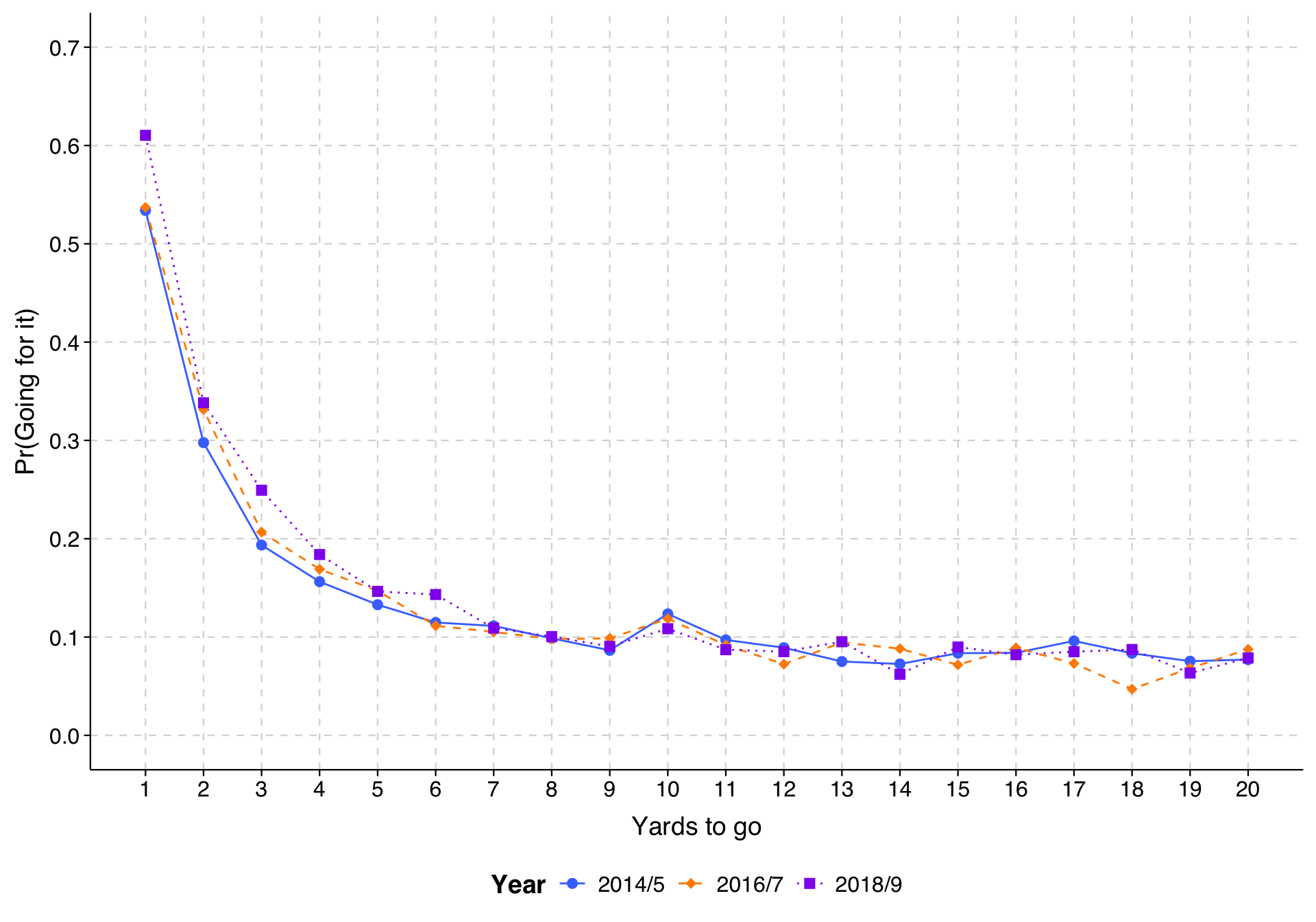
Last, we can combine both approaches, and include interaction terms and model each value of yds_needed and year as a separate coefficient to have the most flexible specification. (We lump years into two-year groups so that we don’t have any small combinations of yds_needed and our recoded year variable.)

Expand to show code that fits model and draws plot
df <- df %>%
  mutate(year_group = case_when(
    year %in% c(2014, 2015) ~ "2014/5",
    year %in% c(2016, 2017) ~ "2016/7",
    year %in% c(2018, 2019) ~ "2018/9"
  )) %>%
  mutate(year_group = factor(year_group, levels = c("2014/5", "2016/7", "2018/9")))

model5 <- glm(goforit ~ as_factor(yds_needed_max20) * year_group + yds_to_td + score_is + gametime,
             data=df,
             family="binomial")

toplot5 <- avg_predictions(model5,
                variables = c(list("yds_needed_max20" = seq(1, 20, 1)),
                              list("year_group" = c("2014/5", "2016/7", "2018/9"))))

ggplot(toplot5, aes(x = yds_needed_max20, y = estimate,
                    color = year_group, shape = year_group, linetype = year_group)) +
  geom_line() +
  geom_point(size = 2.5) +
  scale_color_manual(values = c("royalblue1", "darkorange", "purple2"), name = "Year") +
  scale_shape_manual(values = c(16, 18, 15), name = "Year") +
  scale_linetype_manual(values = c("solid", "dashed", "dotted"), name = "Year") +
  scale_y_continuous(limits = c(0, 0.7), breaks = seq(0, .7, .1)) +
  scale_x_continuous(limits = c(1, 20),
                     breaks = seq(1, 20, 1),
                     minor_breaks = NULL) +
  labs(
    x = "Yards to go",
    y = "Pr(Going for it)"
  ) +
  theme_tula() +
  theme(legend.position = "bottom")

From this, we can see that the tendency for teams to go for it more in recent years appears to have emerged particularly in 2018/9 and particularly in the very short yardage situations. Once a team gets past 4th-and-7 or so, yardage doesn’t make much difference for whether teams decide to go for it (presumably because the main reason they do is when they are behind at the end of the game and have to), and there hasn’t been any change over time.

Important: Prediction plots can only show patterns as complex as the model that has been fit. The simplicity of a pattern in a plot may belie the actual pattern underneath. Of course, you might then wonder why people do not just jump immediately to the most complicated model. If one has a continuous explanatory variable, for example, why not always just break the data into as fine a set of dummy variables as possible and use that?

The answer is that the approach has its own problems, namely that as the size of the dummy-variable-categories gets smaller, the more the predicted probabilities are influenced by chance variation. In other words, the resulting plots are more jagged than they would be if our sample sizes were larger, and that provides a distorted picture of reality as well.