The Cox proportional hazards model is the most commonly used survival analysis model.
The key idea of a proportional hazards model is that the explanatory variables are modeled as having multiplicative effects on the hazard. Specifically, in a proportional hazards model:
Recall that the hazard is the risk of the event occurring at time t, conditional on having survived to time t.
where \(h_0(t)\) is the baseline hazard, or the hazard when all the explanatory variables are 0. As a result, the hazard given a set of values for explanatory variables is the baseline hazard multiplied by exp(\(\mathbf{x}\mathbf{\beta}\)).
Consider the case in which there is one explanatory variable \(x\), with coefficient \(\beta_x\). How does the hazard change as \(x\) increases by one unit, from \(c\) to \(c + 1\)?
When \(x = c\), the hazard is:
\[
h(t|x = c) = h_0(t) \exp(c\beta_x)
\]
When x is increased to \(c + 1\), the new hazard is:
In a proportional hazards model, \(\exp(\beta_x)\) can be interpreted as the multiplicative change in the hazard for a one unit increase in x. This is analogous to exponentiating a coefficient when our outcome is a logged outcome, or when we exponentiated the logit coefficient to interpret results as an odds ratio.
The other important part of the above is that the multiplicative change in the hazard does not depend on \(h_0(t)\). Whatever the baseline hazard is, a unit change in \(x\) changes the hazard by a factor of \(\exp(\beta_x)\).
The big trick of the Cox model is that we estimate our \(\beta_x\) without worrying about the actual value of the baseline hazard at all. What allows us to do this is that, with the Cox model, we do not model the specific time at which the failure event occurs at all. Instead, we model the order at which the failure events occur.
Animal shelter example
Using the Austin Animal Shelter data, we can look at the relationship between a cat’s color and age-at-intake and time to adoption:
Cox regression / Ties: efron
No. of subjects =      17932                          Number of obs =      17932
No. of failures =       7552                          AIC           = 123501.934
Time at risk    =     365396                          Concordance   =     0.5645
Log likelihood  = -61744.967
────────────────────────────────────────────────────────────────────────────────
Surv(time, e~) │Haz. Ratio       DMSE          z     P>|z|  [95% Conf  Interval]
────────────────────────────────────────────────────────────────────────────────
color4cat      │
  white        │     1.511      .1853      3.366     .0008      1.188      1.921
  other one-~r │       1.2     .04461      4.912    <.0001      1.116      1.291
  multicolor   │     1.164     .04483      3.953    <.0001       1.08      1.256
  black        │         1
agecat         │
  5-11 months  │     1.266     .04701      6.341    <.0001      1.177      1.361
  1-3 years    │     .8013     .02989     -5.938    <.0001      .7448      .8621
  > 3 years    │      .654     .02163     -12.84    <.0001      .6129      .6978
  < 5 months   │         1
────────────────────────────────────────────────────────────────────────────────
. stcox i.color4cat i.agecat if cat == 1

        Failure _d: adopted==1
  Analysis time _t: (out_datetime-origin)/8.64e+07
            Origin: time in_datetime

Iteration 0:   log likelihood = -61895.697
Iteration 1:   log likelihood = -61747.218
Iteration 2:   log likelihood = -61745.456
Iteration 3:   log likelihood = -61745.456
Refining estimates:
Iteration 0:   log likelihood = -61745.456

Cox regression with Breslow method for ties

No. of subjects =     17,932                            Number of obs = 17,932
No. of failures =      7,552
Time at risk    = 365,396.49
                                                        LR chi2(6)    = 300.48
Log likelihood = -61745.456                             Prob > chi2   = 0.0000

----------------------------------------------------------------------------------
              _t | Haz. ratio   Std. err.      z    P>|z|     [95% conf. interval]
-----------------+----------------------------------------------------------------
       color4cat |
          white  |   1.510845   .1852585     3.37   0.001     1.188082    1.921293
other one-color  |   1.200268     .04461     4.91   0.000     1.115942    1.290965
     multicolor  |    1.16438    .044833     3.95   0.000     1.079743    1.255652
                 |
          agecat |
    5-11 months  |   1.265657   .0470167     6.34   0.000     1.176781    1.361246
      1-3 years  |   .8013873   .0298916    -5.94   0.000     .7448912    .8621685
      > 3 years  |   .6540586   .0216289   -12.84   0.000     .6130113    .6978545
----------------------------------------------------------------------------------
Interpretations of the exponentiated coefficients are as follows:
White cats have a 51% higher rate of adoption than black cats.
Cats that are 5-11 months when they enter the animal shelter are adopted at a 27% higher rate than younger cats. (The rate was 22% using exponential regression)
Cats that are more than 3 years old when they enter the animal shelter are adopted at a 35% lower rate than cats that were 0-4 months old when entering the shelter.
Survivor function
The above interpretations all concern how the rate differs for different values of the explanatory variables. We do not, from the coefficients alone, have a way of computing what the hazard rate is for any particular group. If we refer back to the earlier formula:
The hazard rate at time \(t\) given \(\mathbf{x}\) depends not just on \(\mathbf{x}\mathbf{\beta}\) but on the baseline hazard, or the hazard when all \(\mathbf{x}\) is 0 (in our example, Black kittens). The estimates from this model do not provide information on what this baseline hazard is.
Instead, what we can do is back out an estimate of the survivor function using the observed survival times. This will then also allow us to estimate the baseline hazard and how it changes over time.
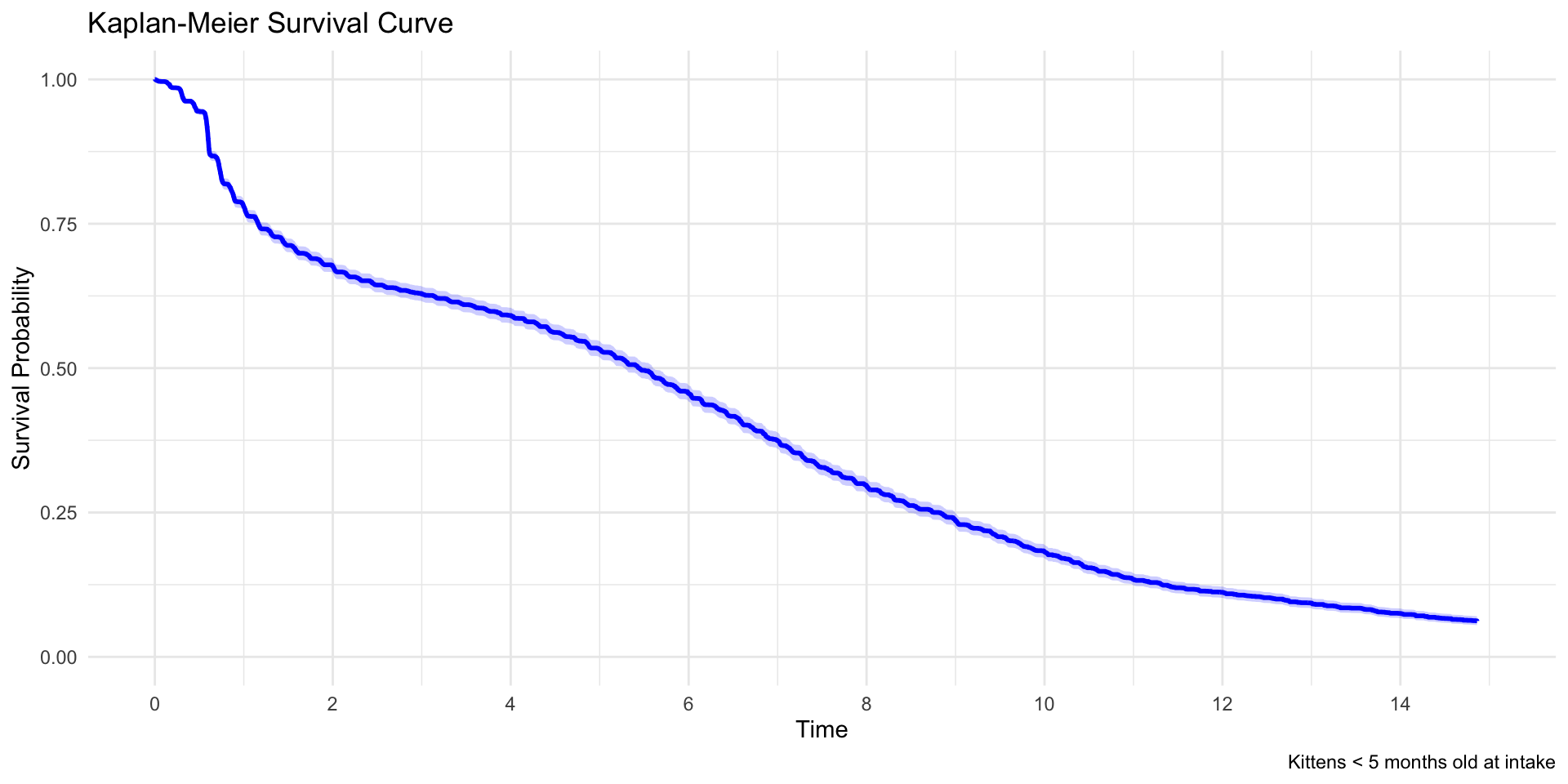
In effect, we can take the Kaplan-Meier curve and adjust for covariates. First, let’s reproduce a Kaplan-Meier curve for these data:
Expand to show code for Kaplan-Meier curve
# Fit Kaplan-Meier curve for kittens (< 5 months) onlykm_fit <-survfit(Surv(time, event) ~1, data = data, subset = (cat ==1& agecat =="< 5 months"))# Extract data for plottingkm_summary <-summary(km_fit)km_data <-data.frame(time = km_summary$time,surv = km_summary$surv,lower = km_summary$lower,upper = km_summary$upper)km_data$time_weeks <- km_data$time /7# Create ggplotggplot(km_data, aes(x = time_weeks, y = surv)) +geom_step(linewidth =1, color ="blue") +geom_ribbon(aes(ymin = lower, ymax = upper), alpha =0.2, fill ="blue", step ="hv") +labs(title ="Kaplan-Meier Survival Curve",caption ="Kittens < 5 months old at intake",x ="Time",y ="Survival Probability" ) +theme_minimal() +scale_y_continuous(limits =c(0, 1)) +scale_x_continuous(breaks =seq(0, 15, 2),limits =c(0, 15) )
Expand to show code for Kaplan-Meier curve
# Print summary statisticskm_fit
Call: survfit(formula = Surv(time, event) ~ 1, data = data, subset = (cat ==
    1 & agecat == "< 5 months"))

   7708 observations deleted due to missingness
         n events median 0.95LCL 0.95UCL
[1,] 10310   4620   38.1      37    39.2
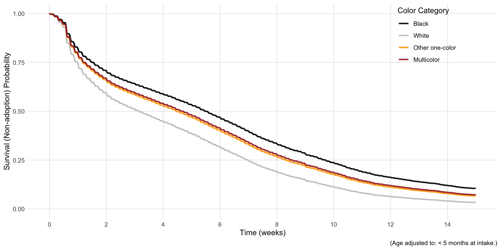
The estimated survivor function effectively takes this curve and incorporates the proportional differences implied by the model results:
Expand to show code for survivor function
library(survival)library(ggplot2)library(tidyverse)library(broom)# Filter data for cats onlycat_data <- data %>%filter(cat ==1)# Get the most common age category to use as referencemost_common_age <-names(sort(table(cat_data$agecat), decreasing =TRUE))[1]# Create newdata for each color category (fixing age at most common level)newdata <-data.frame(color4cat =factor(c("black", "white", "other one-color", "multicolor"),levels =c("black", "white", "other one-color", "multicolor")),agecat =factor(rep(most_common_age, 4), levels =levels(cat_data$agecat)))# Get Cox model survivor functionscox_surv <-survfit(cox_model, newdata = newdata)# Extract survival data using broom::tidysurv_data <-tidy(cox_surv)# Reshape the data from wide to long formatsurv_long <- surv_data %>%select(time, starts_with("estimate."), starts_with("conf.low."), starts_with("conf.high.")) %>%pivot_longer(cols =starts_with("estimate."),names_to ="curve",names_prefix ="estimate.",values_to ="estimate" ) %>%# Also reshape confidence intervalspivot_longer(cols =starts_with("conf.low."),names_to ="curve_low",names_prefix ="conf.low.",values_to ="conf.low" ) %>%filter(curve == curve_low) %>%# Keep matching curvesselect(-curve_low) %>%pivot_longer(cols =starts_with("conf.high."),names_to ="curve_high", names_prefix ="conf.high.",values_to ="conf.high" ) %>%filter(curve == curve_high) %>%# Keep matching curvesselect(-curve_high)# Add color category labelssurv_long$color_category <-factor(case_when( surv_long$curve =="1"~"Black", surv_long$curve =="2"~"White", surv_long$curve =="3"~"Other one-color", surv_long$curve =="4"~"Multicolor" ),levels =c("Black", "White", "Other one-color", "Multicolor"))# Convert time to weekssurv_long$time_weeks <- surv_long$time /7# Filter to 15 weeks (105 days)surv_long <- surv_long %>%filter(time <=105)# Create the plot with regular ggplotcox_surv_plot <-ggplot(surv_long, aes(x = time_weeks, y = estimate, color = color_category)) +geom_step(linewidth =1, alpha =0.9) +scale_color_manual(values =c("black", "gray78", "orange", "brown")) +scale_x_continuous(breaks =seq(0, 15, 2),limits =c(0, 15) ) +scale_y_continuous(limits =c(0, 1),breaks =seq(0, 1, 0.25) ) +labs(x ="Time (weeks)",y ="Survival (Non-adoption) Probability",color ="Color Category",caption =paste("(Age adjusted to:", most_common_age, "at intake.)") ) +theme_minimal() +theme(plot.title =element_text(hjust =0.5, size =12),panel.grid.minor =element_blank(),legend.position =c(0.85, 0.85) )print(cox_surv_plot)
Hazard function
The survivor function is the predicted proportion of cases that have survived to a given point in time. In our case, it is the predicted proportion of animals that have not been adopted.
Non-adoption at time \(t\) means that the adoption did not happen prior to time \(t\). As a result, the survival probability of \(t\) is going to reflect the hazard function prior to \(t\) – in our case, the chance of being adopted on each of the days prior to \(t\).
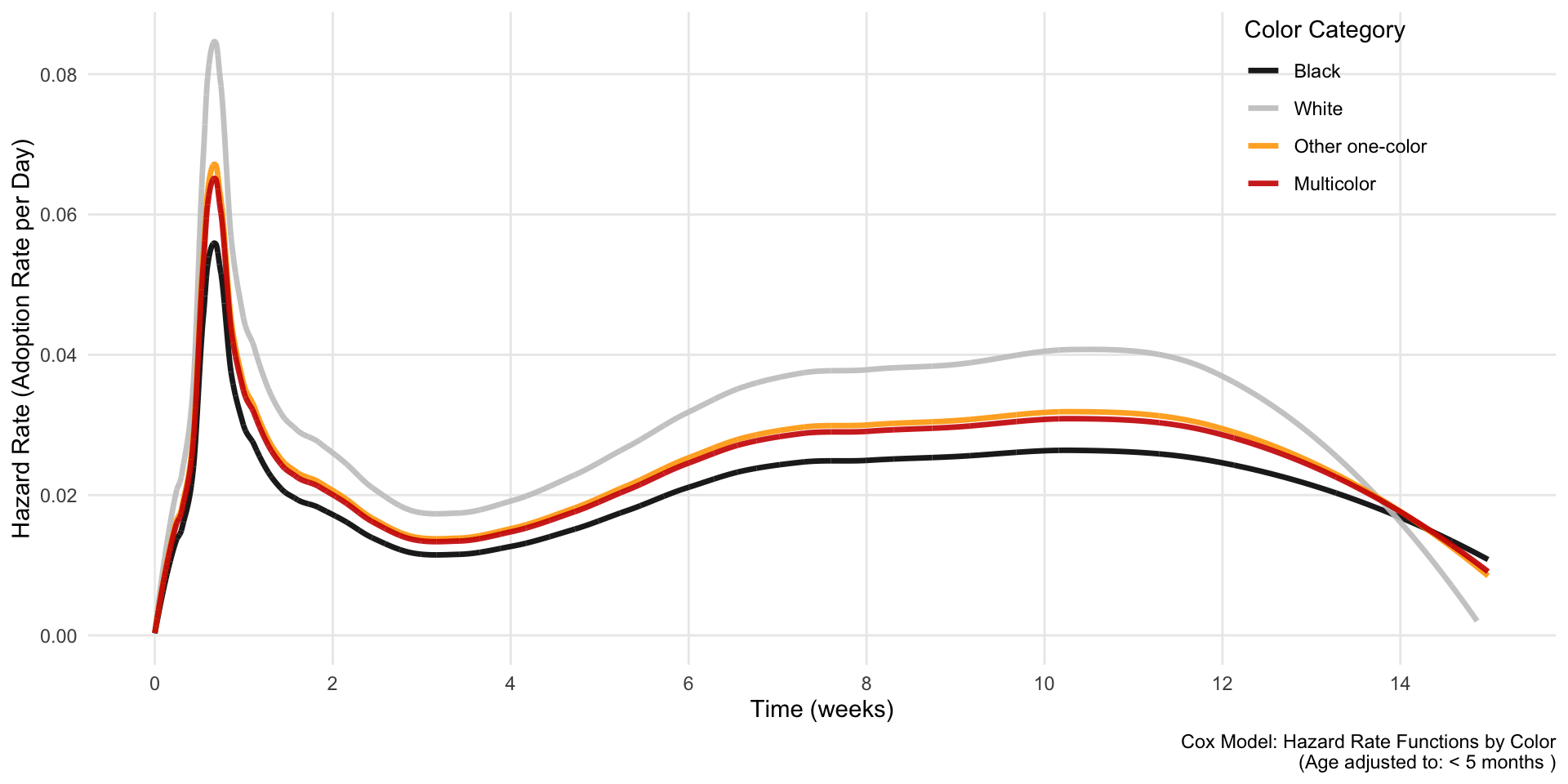
Similarly to what we did with the survivor function, we can take the hazard function implied by the data, and then we can adjust it based on the coefficients of our model.
The plot shows that the highest risk of adoption occurs about a week or so in (perhaps immediately once strays are made available). Then the hazard dips, only to increase again later between weeks 8-10.
The proportional differences among the lines here (should be) strictly a function of the coefficients.
I say “should be” because there is something causing the graph not to behave this way on the right side. I was not able to figure this out in the time I had available, but will return to it.
Throughout, the hazard of white cats being adopted is a bit more than 50% higher than the hazard for Black cats. “Bumps” in the survival curve are more pronounced for white cats, because the 50% increase makes changes more pronounced.
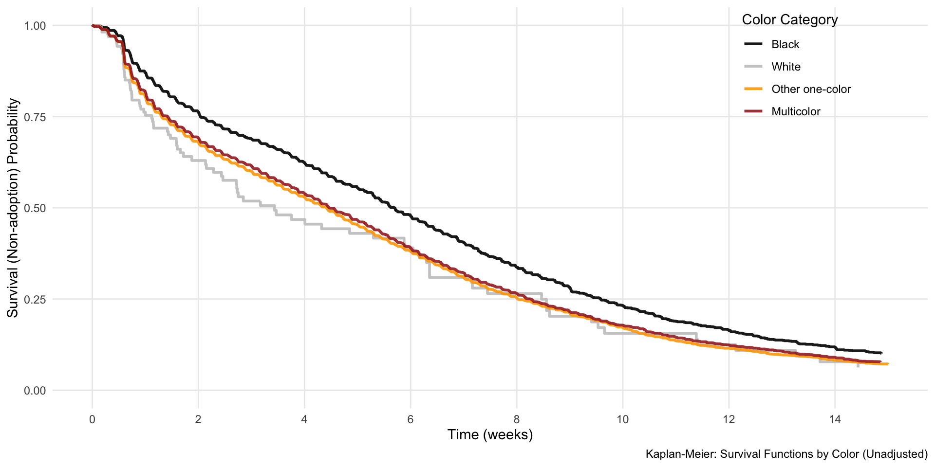
Bonus: comparing survivor function without proportional hazards imposed
Above we showed the survivor function implied by the combination of the empirical distribution of survivor times and the model coefficients. This effectively imposed the proportional hazards assumption on our data. We could relax this by fitting four separate Kaplan-Meier curves. Doing so shows that, while white cats do have a higher rate of adoption early on, their overall rate of non-adoption after 6 weeks is very similar to the other cats that are not black.
Expand to show code for fitting separate K-M curves by color
library(survival)library(ggplot2)library(tidyverse)library(broom)# Filter data for cats onlycat_data <- data %>%filter(cat ==1)# Fit Kaplan-Meier survival curves by color categorykm_fit <-survfit(Surv(time, event) ~ color4cat, data = cat_data)# Extract survival data using broom::tidykm_data <-tidy(km_fit)# The strata column will have the color categories# Clean up the strata nameskm_data$color_category <-factor(case_when( km_data$strata =="color4cat=black"~"Black", km_data$strata =="color4cat=white"~"White", km_data$strata =="color4cat=other one-color"~"Other one-color", km_data$strata =="color4cat=multicolor"~"Multicolor" ),levels =c("Black", "White", "Other one-color", "Multicolor"))# Convert time to weeks and filter to 15 weeks (105 days)km_data$time_weeks <- km_data$time /7km_data <- km_data %>%filter(time <=105)# Create Kaplan-Meier plot with ggplotkm_plot <-ggplot(km_data, aes(x = time_weeks, y = estimate, color = color_category)) +geom_step(linewidth =1, alpha =0.9) +scale_color_manual(values =c("black", "gray78", "orange", "brown")) +scale_x_continuous(breaks =seq(0, 15, 2),limits =c(0, 15) ) +scale_y_continuous(limits =c(0, 1),breaks =seq(0, 1, 0.25) ) +labs(x ="Time (weeks)",y ="Survival (Non-adoption) Probability",color ="Color Category",caption ="Kaplan-Meier: Survival Functions by Color (Unadjusted)" ) +theme_minimal() +theme(plot.title =element_text(hjust =0.5, size =12),panel.grid.minor =element_blank(),legend.position =c(0.85, 0.85) )km_plot