Kaplan-Meier curves are a popular way of visualizing the estimated survival probability across time. Kaplan-Meier curves involve minimal assumptions, and yet they address the problem of censoring in survival data.
Kaplan-Meier curves display the estimated proportion of a group that has survived to time t. The proportion survived is on the \(y\)-axis and time is on the \(x\)-axis.
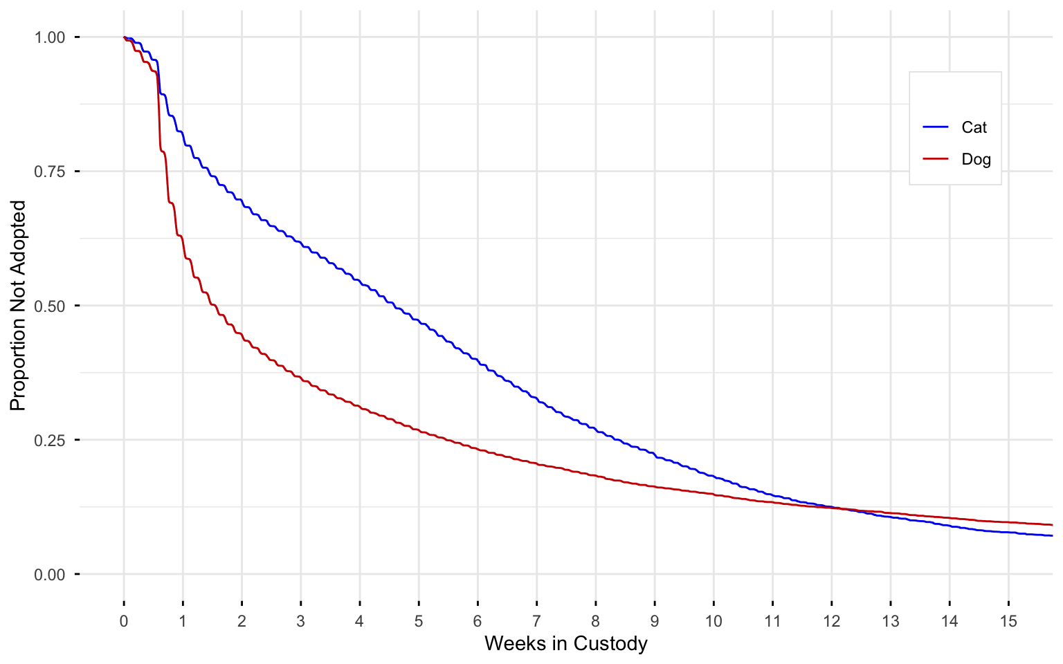
Here is an example comparing time-to-adoption for dogs and cats in the animal shelter system of Austin, TX:
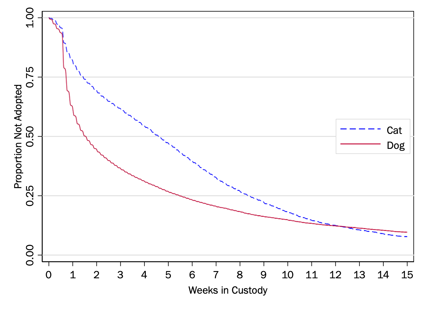
Expand to show code for dependencies and opening data
# Load necessary packageslibrary(survival)library(survminer)library(ggplot2)library(dplyr)library(haven)# Read the Stata dataset# Note: If this doesn't work with readstata13, try using haven::read_dta()data <-read_dta("../dta/austin_animals_stset.dta") %>%rename(event =`_d`) %>%rename(time =`_t`)
Expand to show code for creating survival object and fitting curve
From this graph, we can see that about half of dogs are adopted within two weeks, whereas for cats it takes about five weeks for half to be adopted. Nevertheless, the proportion of cats and dogs that haven’t been adopted at 12 weeks is about the same (around 10 percent of the total). At time 0, the survival proportion of the Kaplan-Meier curve is 1, meaning that everyone is alive at the beginning. At each subsequent interval:
The hazard is the risk of the failure event happening in the time between \(t-1\) and \(t\). Going forward, we will just use \(\mathrm{Hazard}(t)\) to mean the hazard for the interval ending in \(t\).
For the Kaplan-Meier, the estimated Hazard(\(t\)) is given by:
In this formula is the whole trick of the Kaplan-Meier curve. The denominator of the hazard function is the number of observations at risk during the interval in question. If an observation is not observed for this interval, it is simply not counted.
For example, considering a longitudinal survey in which a given person is censored at age 70 because they were alive at this age the last time survey information was collected.
If we were calculating the hazard of someone dying at age 69, they would be part of the denominator, because they were observed and at risk of dying at age 69 but did not die.
If we were calculating the hazard of someone dying at age 71, on the other hand, they would not be part of this denominator, because they were not observed at age 71. At each interval, the hazard is calculated only from those who were observed during that interval.
Hazard function
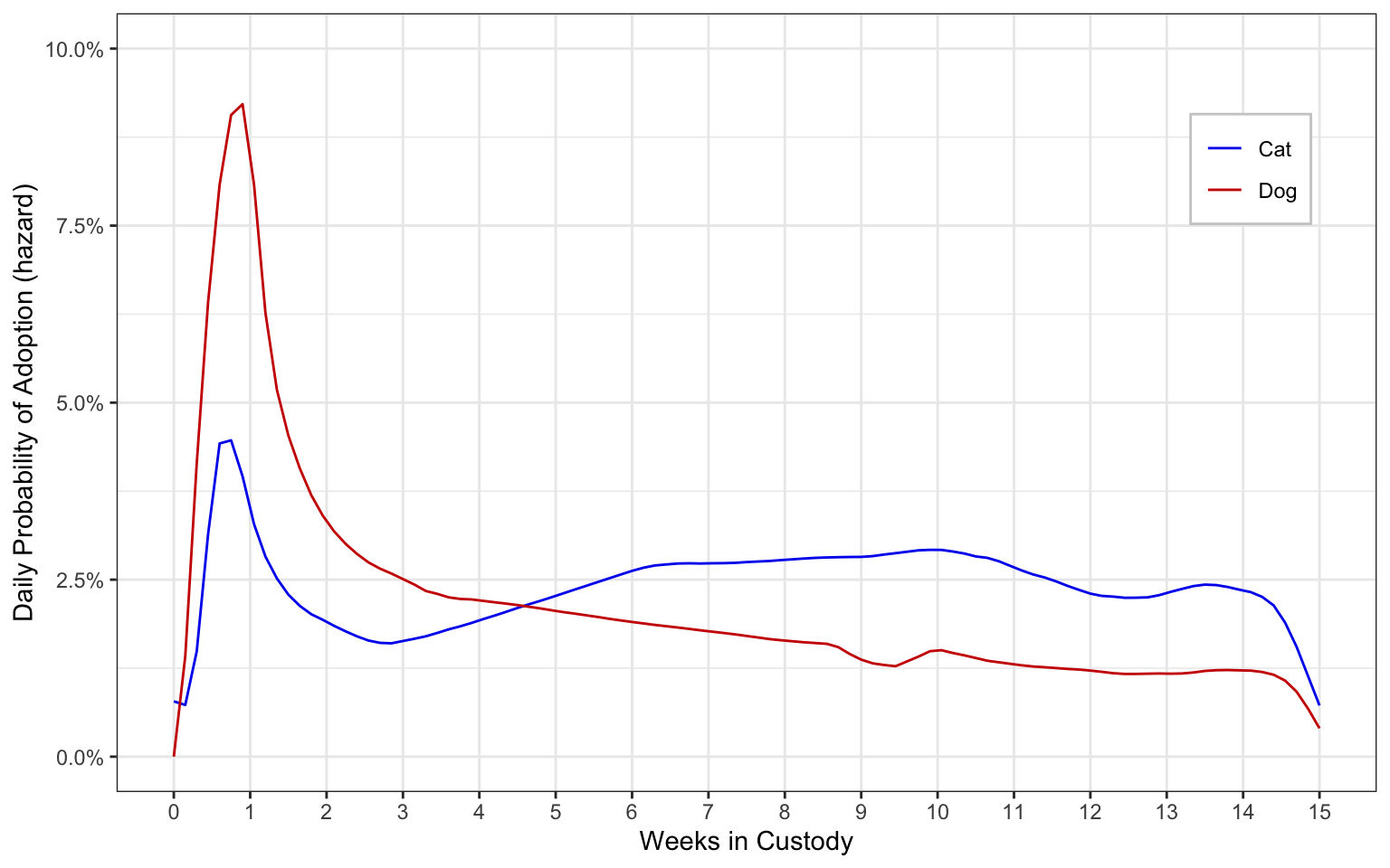
While the Kaplan-Meier technique is normally used for plotting survival curves as shown above, the estimated hazard function can be plotted instead:
To set up the data for the hazard plot in R, we will use the muhaz package, and then the plot itself will be created using ggplot() from the tidyverse package
Expand to show code for drawing the hazard plot
library(muhaz)library(tidyverse)# Separate data for cats and dogscats <- data[data$dog ==0,]dogs <- data[data$dog ==1,]# Calculate hazard estimateshaz_cats <-muhaz(cats$time, cats$event, max.time =105)haz_dogs <-muhaz(dogs$time, dogs$event, max.time =105)# Create a data frame for plottinghaz_data <-data.frame(time =c(haz_cats$est.grid, haz_dogs$est.grid),hazard =c(haz_cats$haz.est, haz_dogs$haz.est),group =factor(c(rep("Cat", length(haz_cats$est.grid)), rep("Dog", length(haz_dogs$est.grid)))))# Create the hazard plothazard_plot <-ggplot(haz_data, aes(x = time, y = hazard, color = group, linetype = group)) +geom_line() +scale_color_manual(values =c("Cat"="blue2", "Dog"="red3")) +scale_linetype_manual(values =c("Cat"="solid", "Dog"="solid")) +labs(x ="Weeks in Custody", y ="Daily Probability of Adoption (hazard)") +scale_x_continuous(limits =c(0, 105),breaks =seq(0, 105, 7),labels =c("0", "1", "2", "3", "4", "5", "6", "7", "8", "9", "10", "11", "12", "13", "14", "15"),minor_breaks =NULL ) +scale_y_continuous(limits =c(0, 0.1),breaks =seq(0, 0.1, 0.025),labels = scales::percent_format(accuracy =0.1) ) +theme_bw() +theme(legend.title =element_blank(),legend.background =element_rect(color ="gray80", linewidth =0.5),legend.position =c(0.9, 0.8) )
What this graph shows is the probability of the failure event (in our case adoption) happening for individuals observed and at risk in the interval. In our case, the intervals are days. Early on, a dog in the shelter has as high as a 7% chance of being adopted on a given day, but this probability drops off quickly after they are in the shelter more than a couple of weeks. Cats, meanwhile, do not have more than a 3% chance of being adopted on a given day, but the probability is more stable and isn’t even especially high in the beginning.
After Week 5, the daily probability for cats is even higher than it is for dogs. Importantly, this is not because so many dogs have been adopted already. Rather, when we see dogs as having less than a 2% probability of being adopted in a given day after week 6, this figure is not at all based on the dogs that have been adopted already. Rather, this is saying that for every 50 dogs who are in the shelter on (for example) Day 42, only 1 is adopted on a given day. The 2%, in other words, is only counting those dogs who are still available to be adopted at that time.
Elaboration: What if we had a continuous measure of time? The example here involves discrete time. The outcome events are observed in terms of the day in which they happened, but not the specific time of day in which they happened. So you can have multiple events at a given time, and an interval of time has a clear and discrete meaning.
Alternatively, though, if we had the time of the failure events continuously measured, we could instead calculate the Kaplan-Meier curve with respect to the time at which each new outcome event occurred. That is, the curve would be horizontal during the periods in which the outcome event does not occur for anyone, and whenever an outcome event does occur, the curve decreases by the amount of the applied hazard.
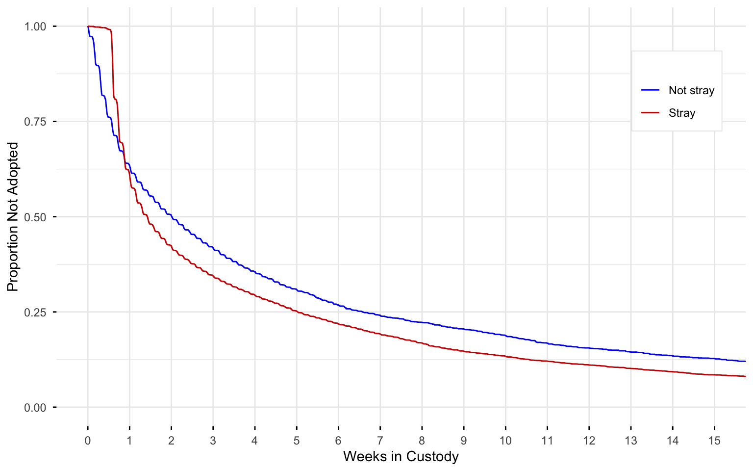
Aside: Why is the rate of adoption slower in the first week?
The data allow one to compare animals that enter the shelter as strays versus surrendered voluntarily by owners. When one looks at this, it is evident that virtually no stray cats or dogs are adopted in their first week in the shelter, presumably because the shelter waits to make them available for them in the event that their persons come looking for them.
Expand to show code for fitting curve and drawing plot
data_dogs_only <- data %>%filter(dog ==1)surv_obj_dogs <-Surv(time = data_dogs_only$time, event = data_dogs_only$event)# 1. Kaplan-Meier Survival Curvekm_fit_dogs <-survfit(surv_obj_dogs ~ stray, data = data_dogs_only)#| code-fold: true#| code-summary: "Expand to show code for drawing the Kaplan-Meier plot"km_plot <-ggsurvplot( km_fit_dogs,data = data_dogs_only,risk.table =FALSE,conf.int =FALSE,censor =FALSE, pval =FALSE, xlim =c(0, 105),break.x.by =7,title ="Dogs only",xlab ="Weeks in Custody",ylab ="Proportion Not Adopted",legend.title ="",legend.labs =c("Not stray", "Stray"),legend =c(0.9, 0.8), # Approximate position (0-1 scale) similar to pos(3) in Statalinetype =c("solid", "solid"),palette =c("blue2", "red3"),size =0.5,ggtheme =theme_minimal() +theme(plot.title =element_blank(),legend.background =element_rect(color ="gray90", linewidth = .3),panel.grid.minor.x =element_blank() )) km_plot$plot <- km_plot$plot +scale_x_continuous(breaks =seq(0, 105, by =7),labels =c("0", "1", "2", "3", "4", "5", "6", "7", "8", "9", "10", "11", "12", "13", "14", "15") )