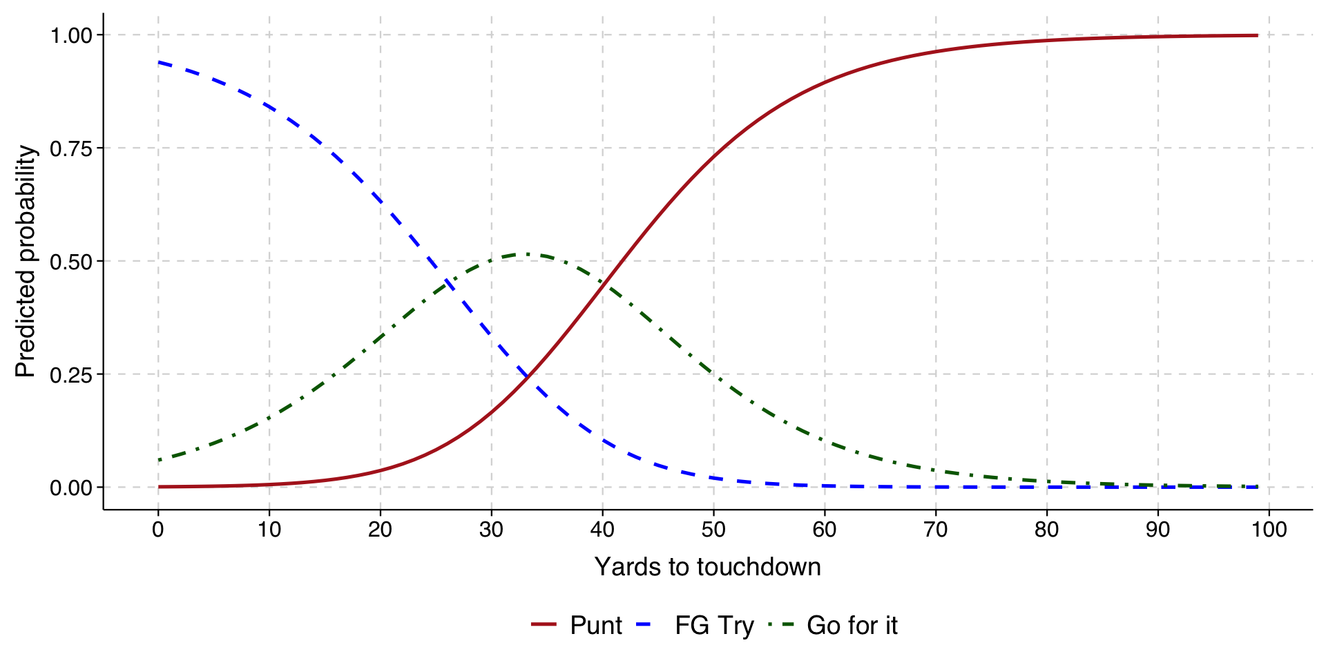
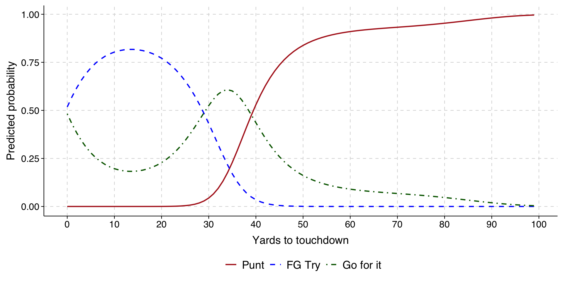
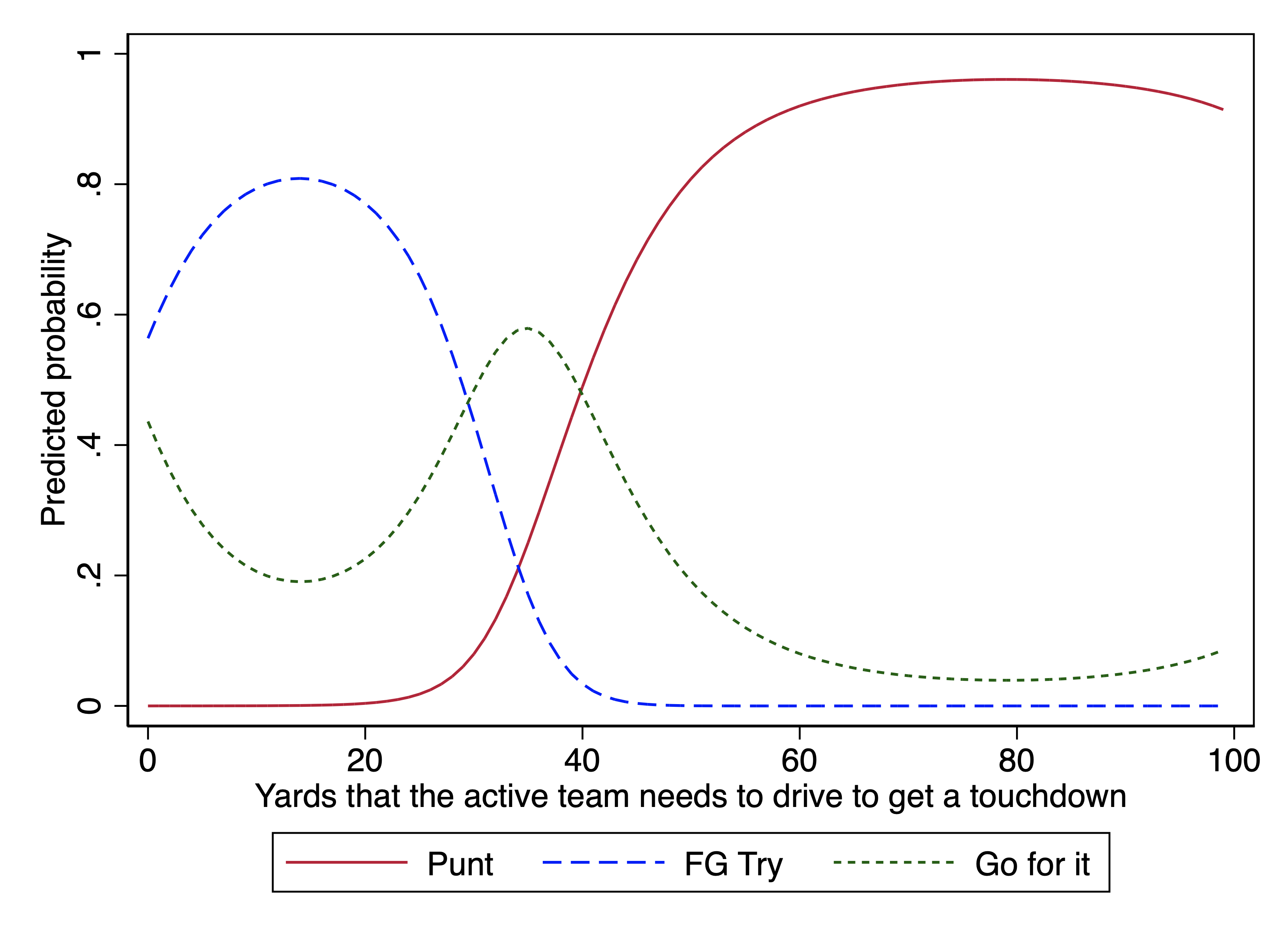
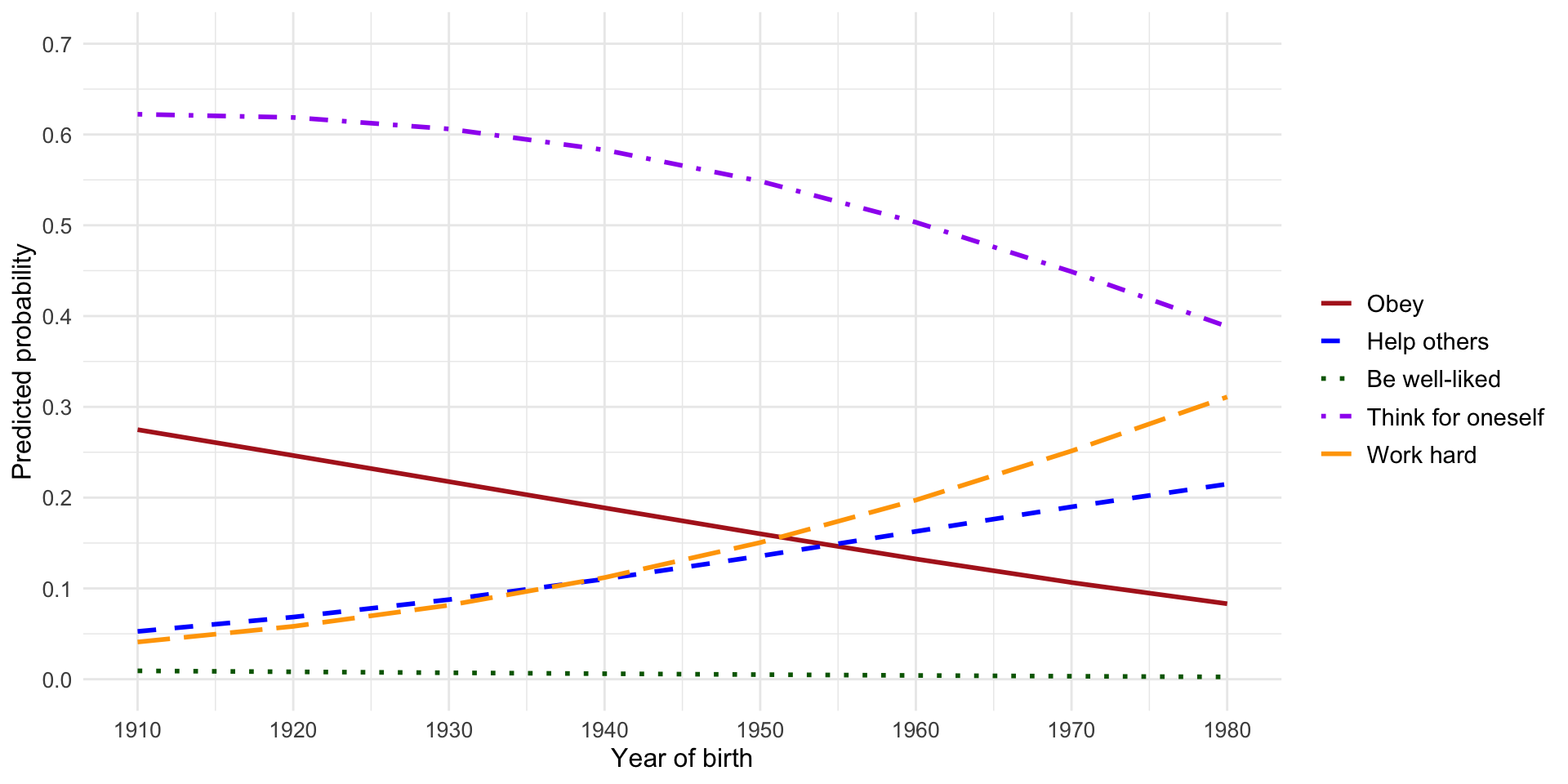
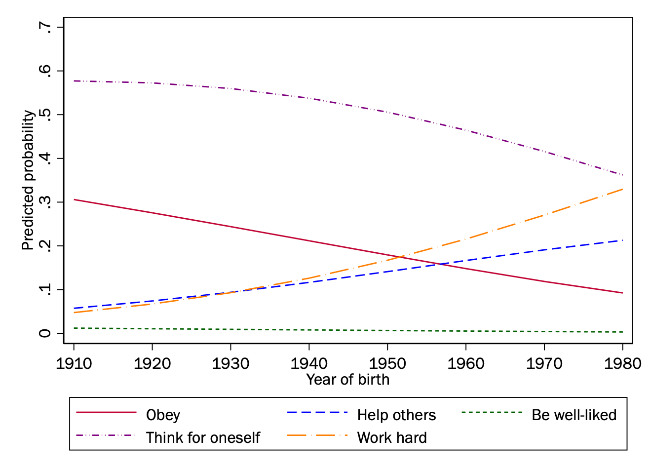
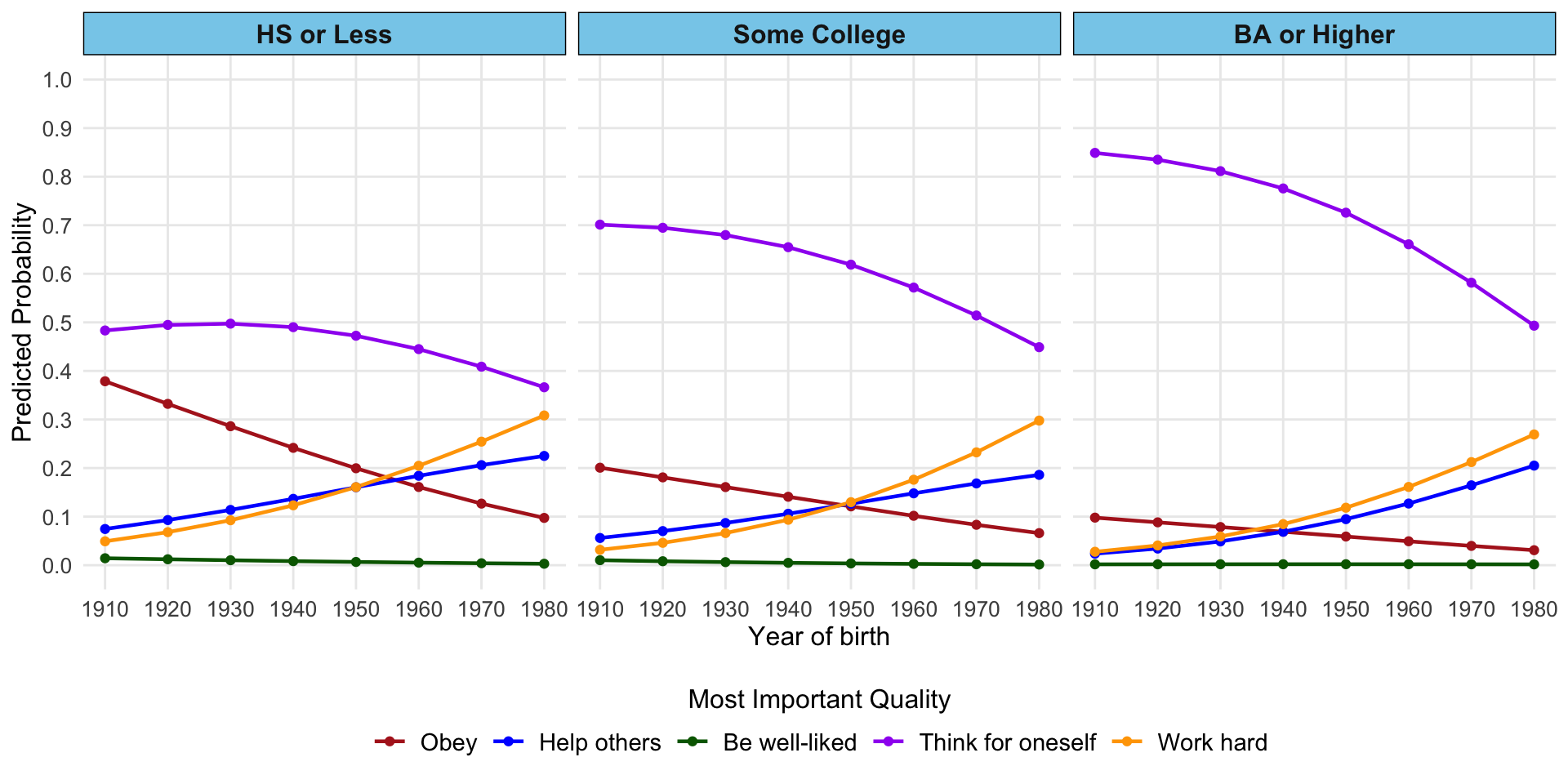
# Generate predictions at specified values of cohort1900
predictions <- predictions(
  model,
  newdata = datagrid(cohort1900 = seq(10, 80, 10)),
  type = "probs"
)

# Create plot data
plot_data <- predictions %>%
  dplyr::select(cohort1900, group, estimate) %>%
  rename(category = group, probability = estimate)

# Define colors and line patterns that match Stata graph
colors <- c(
  "1" = "firebrick",
  "2" = "blue",
  "3" = "darkgreen",
  "4" = "purple",
  "5" = "orange")

# Create x-axis labels that combine cohort values with years
x_labels <- c("1910", "1920", "1930", "1940", "1950", "1960", "1970", "1980")
names(x_labels) <- c(10, 20, 30, 40, 50, 60, 70, 80)

# Create plot
ggplot(plot_data, aes(x = cohort1900, y = probability, color = category, linetype = category)) +
  geom_line(size = 1) +
  scale_color_manual(
    values = colors,
    labels = c("Obey", "Help others", "Be well-liked", "Think for oneself", "Work hard"),
    name = ""
  ) +
  scale_linetype_manual(
    values = c("solid", "dashed", "dotted", "dotdash", "longdash"),
    labels = c("Obey", "Help others", "Be well-liked", "Think for oneself", "Work hard"),
    name = ""
  ) +
  scale_x_continuous(
    breaks = seq(10, 80, 10),
    labels = x_labels,
    name = "Year of birth"
  ) +
  scale_y_continuous(
    limits = c(0, 0.7),
    breaks = seq(0, 0.7, 0.1),
    name = "Predicted probability"
  ) +
  theme_minimal() +
  theme(
    legend.position = "right",
    legend.direction = "vertical",
    legend.text = element_text(size = 11),
    axis.title = element_text(size = 12),
    axis.text = element_text(size = 10)
  ) +
  guides(
    color = guide_legend(nrow = 5, byrow = TRUE),
    linetype = guide_legend(nrow = 5, byrow = TRUE)
  )