The most effective way to present a nonlinear relationship between a continuous explanatory variable and an outcome is with plots. We are going to consider some strategies for plotting results for the ordered logit (or ordered probit) model here.
For these plots, we will be using the example of the General Social Survey question about support for national spending on improving and protecting health. The question is particularly interesting because of work on how response to this measure changed in the wake of Obamacare in early 2010 (before the 2010 GSS was fielded).
── Attaching core tidyverse packages ──────────────────────── tidyverse 2.0.0 ──
✔ dplyr     1.2.0     ✔ readr     2.2.0
✔ forcats   1.0.1     ✔ stringr   1.6.0
✔ ggplot2   4.0.2     ✔ tibble    3.3.1
✔ lubridate 1.9.5     ✔ tidyr     1.3.2
✔ purrr     1.2.1
── Conflicts ────────────────────────────────────────── tidyverse_conflicts() ──
✖ dplyr::filter() masks stats::filter()
✖ dplyr::lag()    masks stats::lag()
ℹ Use the conflicted package (<http://conflicted.r-lib.org/>) to force all conflicts to become errors
library(haven)library(MASS)
Attaching package: 'MASS'

The following object is masked from 'package:dplyr':

    select
library(marginaleffects)# Read and prepare datadf <-read_dta("../dta/gss_natheal.dta") %>%filter(as.integer(natheal) <=3) %>%mutate(natheal =factor(as_factor(natheal),levels =c("too little", "about right", "too much")),year_numeric =as.numeric(as.character(as_factor(year))),party =relevel(as_factor(party), ref ="indep"),female =as_factor(female),race4cat =relevel(as_factor(race4cat), ref ="black")) %>%drop_na(race4cat, party)# Fit ordered logit model with year as continuous predictormodel_year_cont <-polr(natheal ~ year_numeric + party + female + race4cat + age,data = df,Hess =TRUE, method ="logistic",weights = df$wtssall)
Warning in eval(family$initialize): non-integer #successes in a binomial glm!
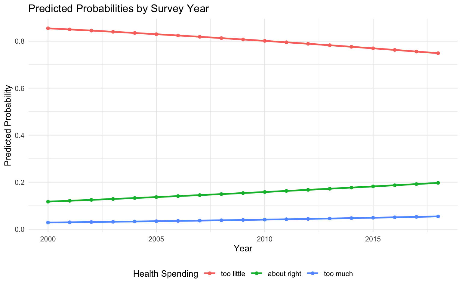
# Generate predictions across range of yearspred_data <-datagrid(model = model_year_cont,year_numeric =seq(2000, 2018, by =1))predictions <-predictions(model_year_cont, newdata = pred_data)# Plot predicted probabilities across yearspredictions %>%ggplot(aes(x = year_numeric, y = estimate, color = group)) +geom_line(linewidth =1) +geom_point() +theme_minimal() +labs(title ="Predicted Probabilities by Survey Year",x ="Year", y ="Predicted Probability",color ="Health Spending") +theme(legend.position ="bottom")
The plots here are made using Stata. As ever, the Stata code for making all of these plots is available in the .do file that accompanies this page.
Stata: \(\mathtt{margins}\), \(\mathtt{marginsplot}\), and \(\mathtt{mgen}\). These graphs all are made by using \(\mathtt{margins}\) after the \(\mathtt{ologit}\) command to generate the values we want to plot. Then, one of two strategies is used to draw the plot. The first is to use Stata’s built-in \(\mathtt{marginsplot}\) command. The second is to use the add-on \(\mathtt{mgen}\) package (co-authored by yours truly and part of the \(\mathtt{spost13\_ado}\) package).
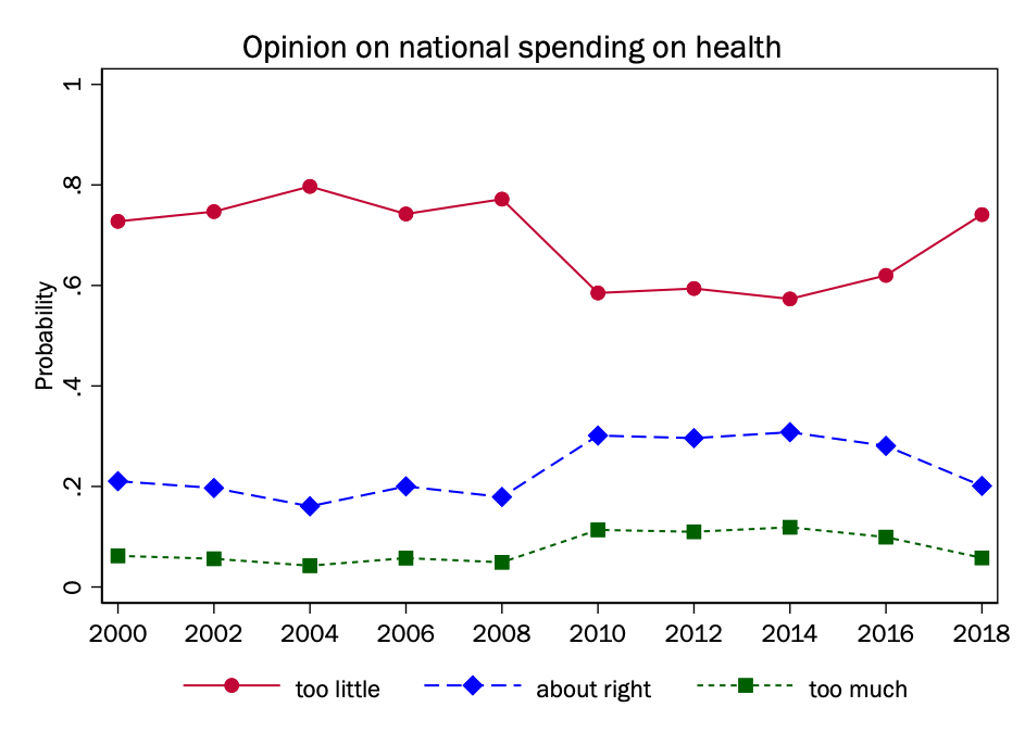
Plotting the changing probability of all outcomes
In this first plot, survey year is simply in the model as a continuous explanatory variable, where its relationship with the outcome is modeled as a single ordered logit coefficient.
Given that we think that the relationship with the outcome might change in ways that are not captured by a single term (specifically after 2009), we will here model year as a factor variable, so we have separate terms for each year.
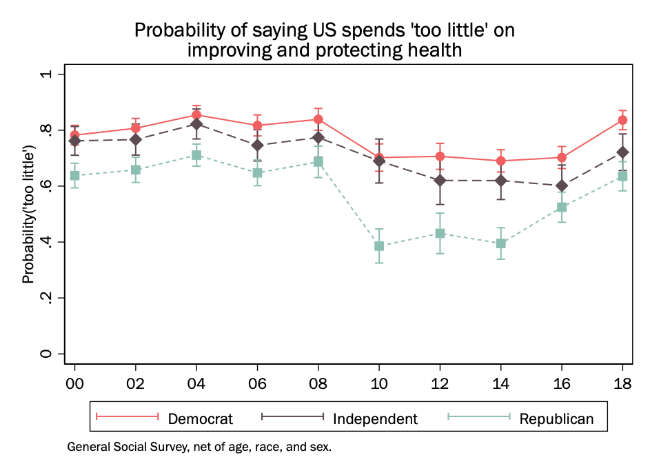
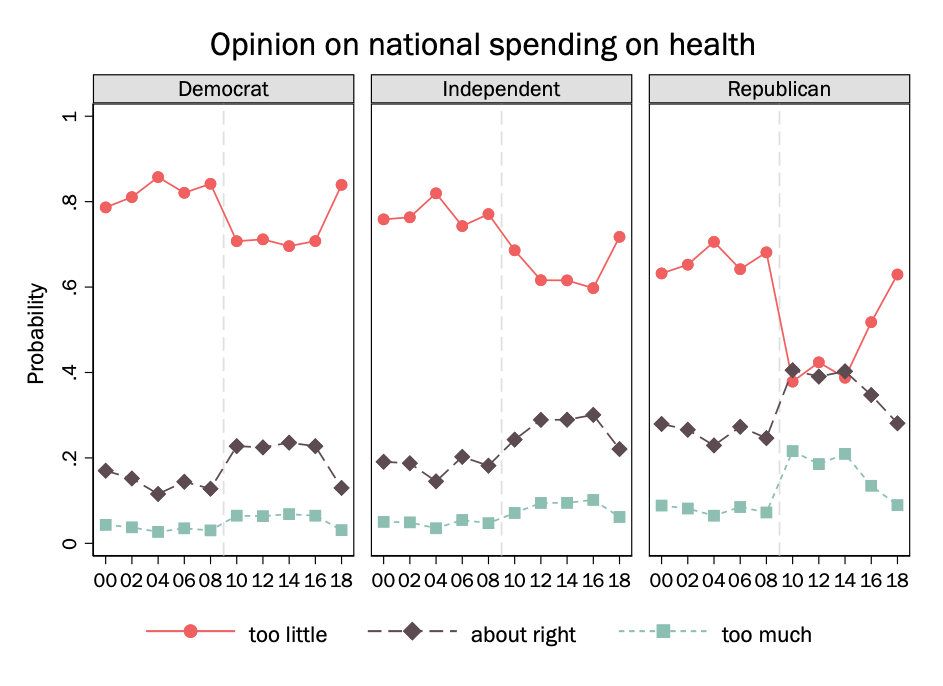
We are interested particularly in how these differences may vary by party. So we may fit the interaction between party and year (as a factor variable) and then make separate plots for Democrats, Republicans, and independents.
Plotting the changing probability of a single outcome
We can also just plot the probability of a single outcome if we think this is telling of the larger pattern.
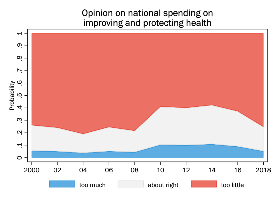
Plotting cumulative outcomes
Instead of using lines on the plot to represent the probability of individual outcomes, one can instead use the lines for cumulative outcomes, that is \(\Pr(y <= m)\). When that is done, the area between the lines represents the probability of each category. We can shade each area separately.
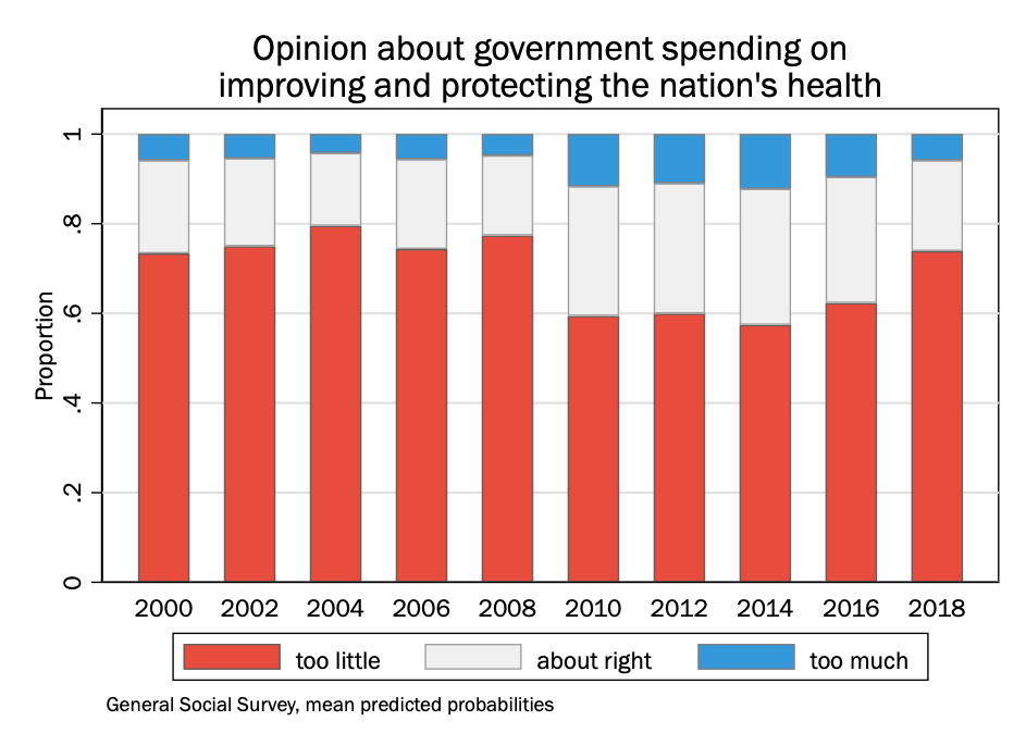
Given that year in the General Social Survey is a set of discrete values, we could also do this as a stacked bar chart, where each survey year is its own bar:
Stata: Color choices. if you are going to draw a plot with multiple shaded areas, you may want to try to figure out colors that you think look sharp together on your own rather than relying on whatever Stata’s default color choices are. The leading graphics packages for R are much more sophisticated than Stata when it comes to color palettes, and it can make a big difference aesthetically for any graph where there will be large amounts of different colors.
Happily, though, there are many color palette resources online, and it is easy to get the RGB code for any color on one’s screen. (Apple, for example, has a color picker as a built-in tool.) While Stata has many named colors you can choose from–the dominant one that I use in notes is “cranberry”–you can specify any RGB color by putting the RGB value in quotes instead of the color name: that is \(\mathtt{\text{"}156 7 38\text{"}}\) instead of \(\mathtt{cranberry}\).