Poisson regression

We have discussed how the Poisson distribution follows from a specific sort of data generating process: one in which events occur independently and at a specific and constant rate, indicated by \(\lambda\), over all observations. When instead the rate \(\lambda\) varies over observations, the data will no longer follow a Poisson distribution, but instead it will have greater variance.

The premise of Poisson regression is that the data are conditionally distributed as Poisson. In other words, for observations that share the same values of \(\mathbf{x}\), the data are distributed as Poisson.

The data as a whole, on the other hand, will have a higher variance than expected under Poisson, which means the data as a whole will not be Poisson distributed.

The Poisson regression model

In the Poisson regression model, our outcome is the log of the rate \(\lambda\):

\[ \ln(\lambda) = \mathbf{x}\mathbf{\beta} \]

Consequently, when we exponentiate both sides of the equation, \(\exp(\mathbf{x}\mathbf{\beta})\) provides our estimate of \(\lambda\) given \(\mathbf{x}\).

And, taking the formula provided earlier for the Poisson distribution, we can calculate the predicted probability of any given count for the \(\lambda\) implied by the value of \(\mathbf{x}\) and our coefficients for any observation:

\[ \begin{align} \Pr(y=k) & = \frac{\lambda^k \exp\left(-\lambda\right)}{k!} \\ \\ & = \frac{\exp(\mathbf{x}\mathbf{\beta})^k \exp\left(-\exp(\mathbf{x}\mathbf{\beta})\right)}{k!} \end{align} \]

We use the predicted probabilities of the observed values to fit the model using maximum likelihood. That is, for each observation, the likelihood is the predicted probability of the observed count.

Toy example

We will use a simulated data example, modeled after our discussion of the Prussian horse-kick data. The reason we are using simulated instead of real data is that, with a simulation, we control the data generating process and so we know that the answer ought to be given how we simulate the data. Another advanatge is that by simulating data we know the data does not violate an important assumption of Poisson regression that we will discuss shortly.

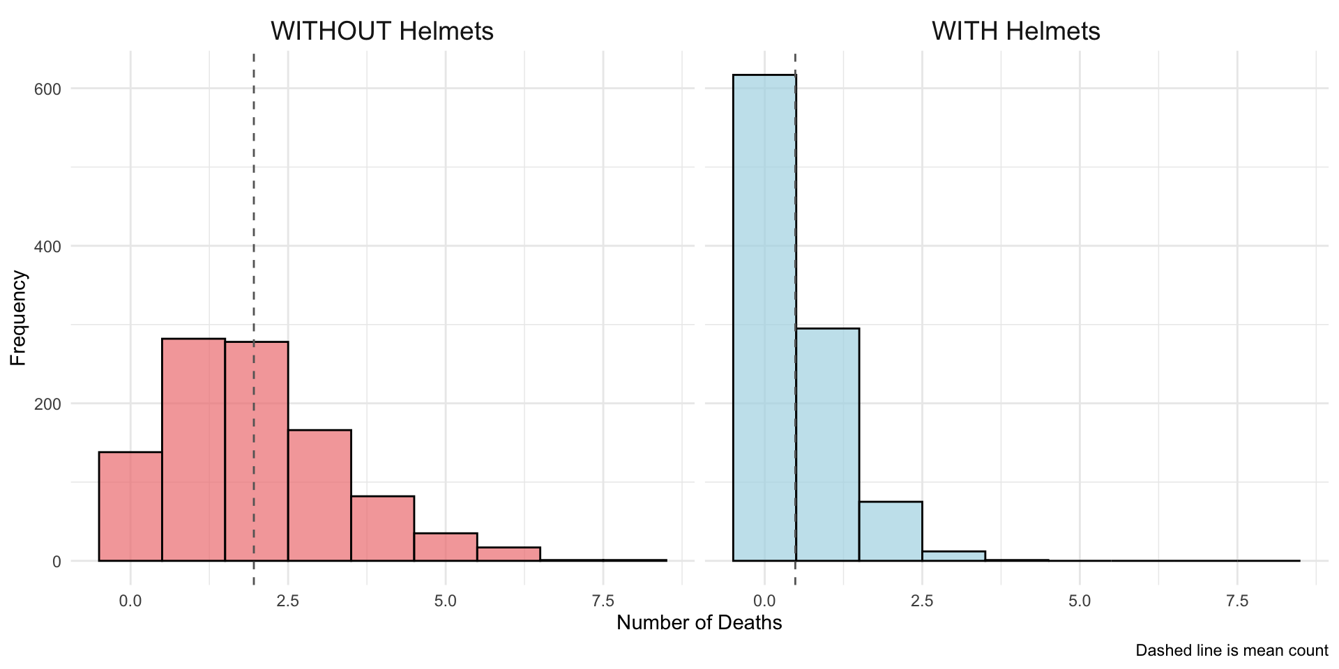
To motivate our simulation, say that death-by-horsekick was a random event, but that some units wear helmets and that this lowers the risk of dying. The expected mean mortality rate for units without helmets is 2 deaths per unit, but with helmets this decreases to .5. Helmets, thus, decrease the mortality rate by 75%.

We have 500 units with helmets and 500 units without helmets. Here’s a cross-tab of our simulated data:

Expand to show code to simulate data
library(tidyverse)
set.seed(8675309)

helmets <- c(rep(TRUE, 1000), rep(FALSE, 1000))

deaths <- ifelse(helmets == TRUE,
                     rpois(1000, lambda = 0.5),
                     rpois(1000, lambda = 2.0))

prussian_sim <- data.frame(
  helmets = helmets,
  deaths = deaths
)
prussian_sim %>%
  group_by(helmets) %>%
  summarize(avg_count = mean(deaths),
            n_units = n())
# A tibble: 2 × 3
  helmets avg_count n_units
  <lgl>       <dbl>   <int>
1 FALSE       1.96     1000
2 TRUE        0.485    1000

In our data, as expected, the average count for the units without helmets is approximately 2, and for the units with helmets is approximately .5.

The relatively frequency of units with each count may be shown with these histograms:

#| code-fold: true
#| code-summary: "Expand for code that draws plots"

ggplot(prussian_sim, aes(x = deaths, fill = helmets)) +
  geom_histogram(bins = max(prussian_sim$deaths) + 1, 
                 color = "black", alpha = 0.7) +
  facet_wrap(~helmets, 
             labeller = labeller(helmets = c("TRUE" = "WITH Helmets", 
                                           "FALSE" = "WITHOUT Helmets"))) +
  scale_fill_manual(values = c("TRUE" = "lightblue", "FALSE" = "lightcoral")) +
  labs(x = "Number of Deaths",
       y = "Frequency",
       caption = "Dashed line is mean count") +
  theme_minimal() +
  theme(legend.position = "none") +
  geom_vline(data = prussian_sim %>% 
               group_by(helmets) %>% 
               summarise(mean_fat = mean(deaths)),
             aes(xintercept = mean_fat), 
             color = "gray40", linetype = "dashed", linewidth = .5) +
  theme(strip.text = element_text(size = 14))

. tab deaths helmets, col nokey

           |        helmets
    deaths |         0          1 |     Total
-----------+----------------------+----------
         0 |        67        309 |       376 
           |     13.40      61.80 |     37.60 
-----------+----------------------+----------
         1 |       137        142 |       279 
           |     27.40      28.40 |     27.90 
-----------+----------------------+----------
         2 |       125         42 |       167 
           |     25.00       8.40 |     16.70 
-----------+----------------------+----------
         3 |        93          5 |        98 
           |     18.60       1.00 |      9.80 
-----------+----------------------+----------
         4 |        48          2 |        50 
           |      9.60       0.40 |      5.00 
-----------+----------------------+----------
         5 |        21          0 |        21 
           |      4.20       0.00 |      2.10 
-----------+----------------------+----------
         6 |         6          0 |         6 
           |      1.20       0.00 |      0.60 
-----------+----------------------+----------
         7 |         3          0 |         3 
           |      0.60       0.00 |      0.30 
-----------+----------------------+----------
     Total |       500        500 |     1,000 
           |    100.00     100.00 |    100.00 

Or, as histograms:

As you can see, there are many more zero counts for the units with helmets and many more high counts for the units without helmets.

We will now the relationship between fatalities and helmet use using Poisson regression:

In R, we can fit a Poisson regression model using the glm() function. We fit a Poisson regression by specifying family=poisson.

model <- glm(deaths ~ helmets, 
                     data = prussian_sim, 
                     family = poisson)

summary(model)

Call:
glm(formula = deaths ~ helmets, family = poisson, data = prussian_sim)

Coefficients:
            Estimate Std. Error z value Pr(>|z|)    
(Intercept)  0.67090    0.02261   29.67   <2e-16 ***
helmetsTRUE -1.39451    0.05072  -27.49   <2e-16 ***
---
Signif. codes:  0 '***' 0.001 '**' 0.01 '*' 0.05 '.' 0.1 ' ' 1

(Dispersion parameter for poisson family taken to be 1)

    Null deviance: 3089.1  on 1999  degrees of freedom
Residual deviance: 2139.2  on 1998  degrees of freedom
AIC: 5215.2

Number of Fisher Scoring iterations: 5

We obtain a coefficient of -1.39. The sign of the coefficients shows us that the mortality rate is lower for the units that wear helmets.

The magnitude of the coefficient is an additive difference in the log-rate. As with other models we have considered with a logged outcome, we make the coefficient more interpretable by exponentiating it:

exp(coef(model))
(Intercept) helmetsTRUE 
   1.956000    0.247955 

The exponentiated coefficient is .25. This corresponds to what we simulated: the mortality rate for units that wear helmets is .25 the size of the mortality rate for units without helmets; that is, the mortality rate for units that wear helmets is 75% less.

We can fit a Poisson regression model:

. poisson deaths helmets

Iteration 0:   log likelihood =  -1331.238  
Iteration 1:   log likelihood = -1331.2219  
Iteration 2:   log likelihood = -1331.2219  

Poisson regression                                      Number of obs =  1,000
                                                        LR chi2(1)    = 502.61
                                                        Prob > chi2   = 0.0000
Log likelihood = -1331.2219                             Pseudo R2     = 0.1588

------------------------------------------------------------------------------
      deaths | Coefficient  Std. err.      z    P>|z|     [95% conf. interval]
-------------+----------------------------------------------------------------
     helmets |  -1.410105   .0706856   -19.95   0.000    -1.548646   -1.271564
       _cons |   .7129498   .0313112    22.77   0.000      .651581    .7743187
------------------------------------------------------------------------------

The negative sign of the coefficient indicates that helmets decrease the rate of deaths. However, for interpretation, we would likely want to exponentiate this coefficient.

\[ \exp(-1.41) = .244 \]

This is the factor change in the rate. Remember that we simulated these data so that we know the rates are approximately .5 for the corps with helmets and 2 for the corps without. So indeed, the mortality rate for the corps with helmets is only about 25% as much as the mortality rate with corp without helmets, because .5 is about 25% as much as 2.

We could interpret the result in terms of the percentage decrease:

  • The mortality rate for units with helmets is about 75% lower than the mortality rate for units without helmets.

where the 75% comes from (1 - .244).

Austin animal shelter example

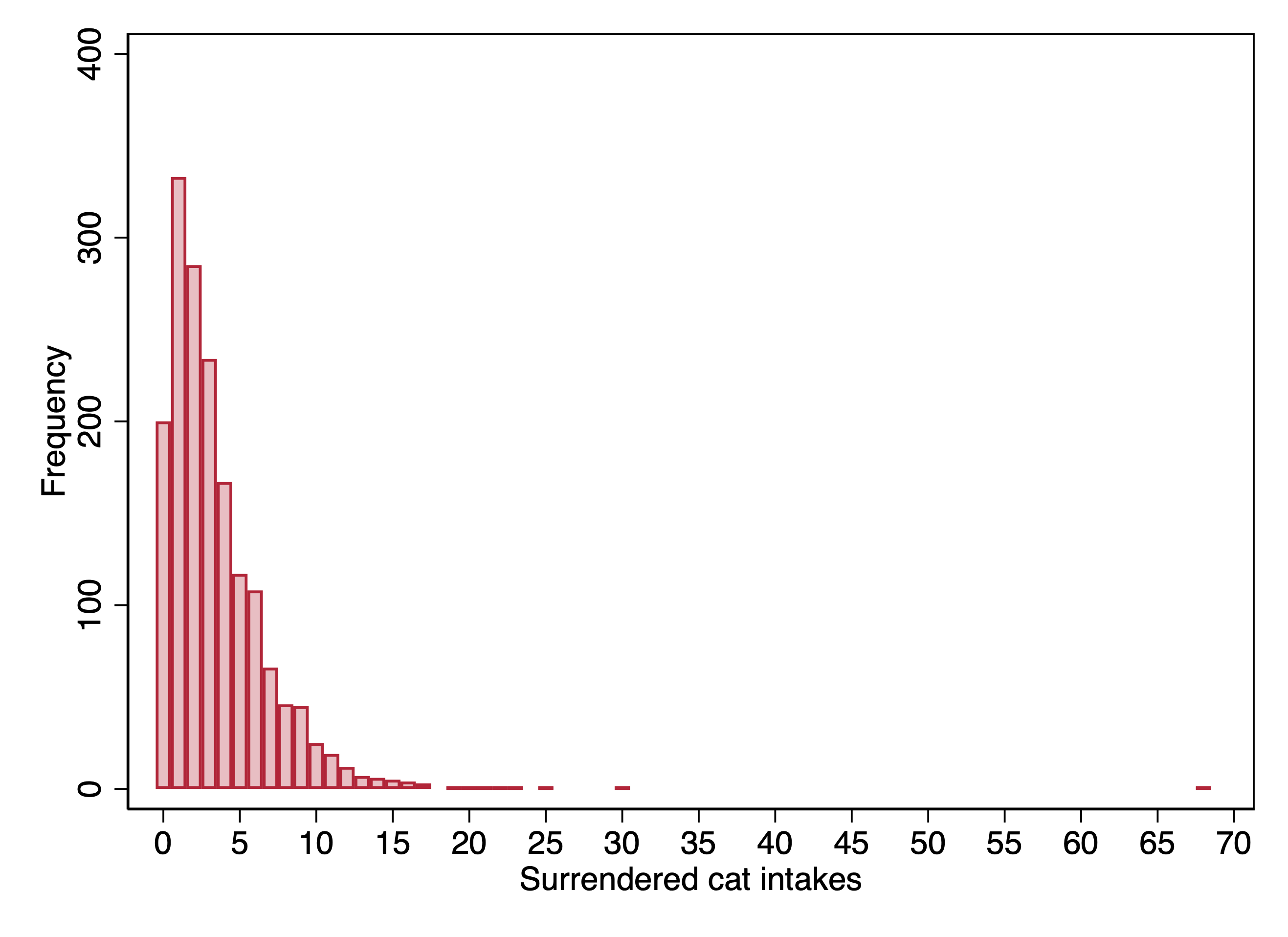
The dataset \(\texttt{austin\_animals\_dailycounts}\) includes daily date on the number of animals of different types arriving at the shelter. We will look at the outcome of the number of cats surrendered on a day. We can look at a histogram of this outcome:

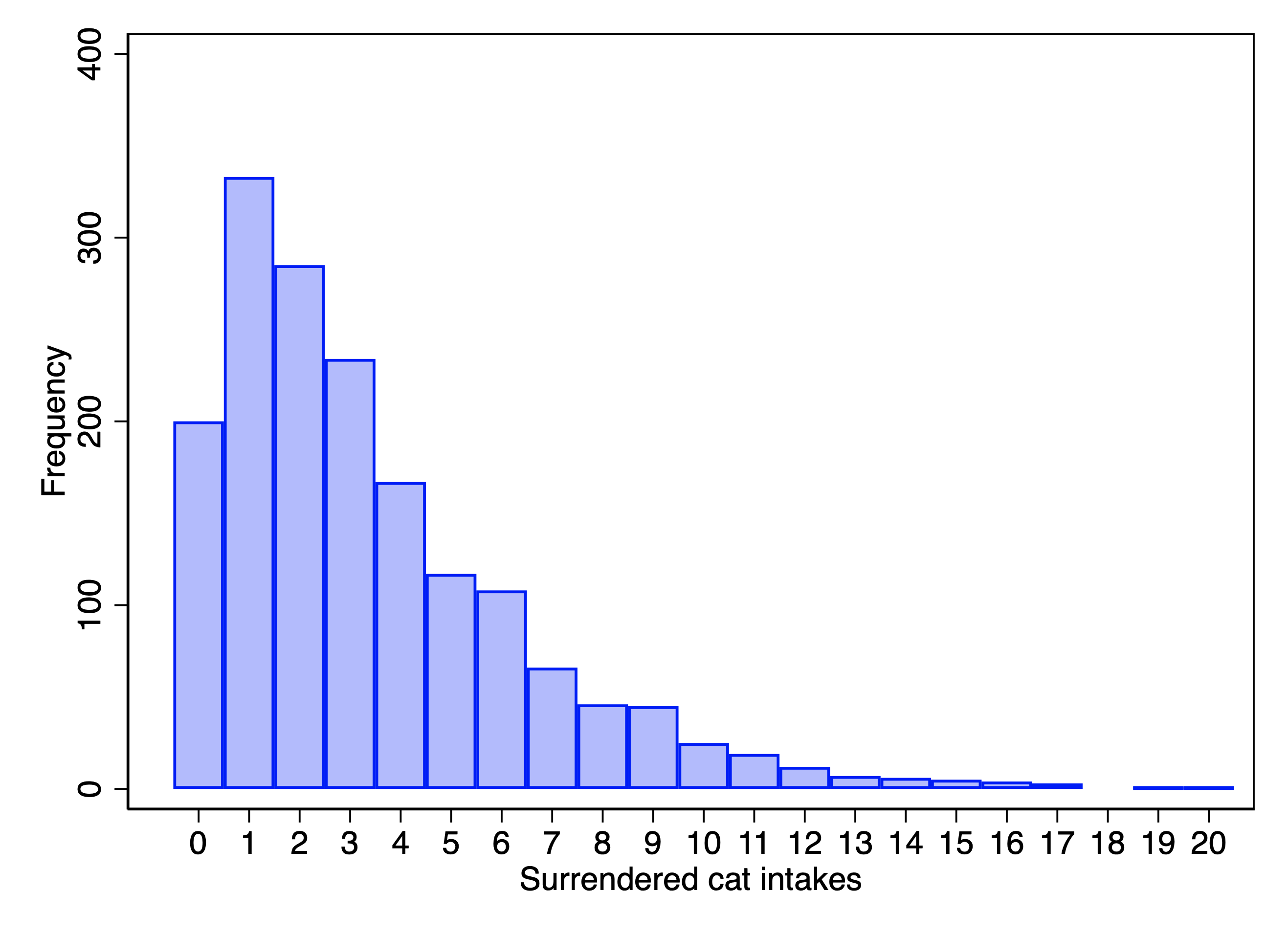
Given that this is real data, we run into an issue where we have some outliers. Given that the median number of cats per day is 3, it seems obviously not just a matter of random chance that we have a day when 68 cats were surrendered. Instead, one suspects that some of these extreme days reflect a cat hoarder who was probably compelled to give up their cats (or died). Because these seem like fluke events that I don’t want to overwhelm the overall pattern in the data, I am going to make the executive decision and recode any counts of greater than 20 to 20.

In the Stata version, I cut counts greater than 20, rather than recode to 20. Recoding in retrospect seems like the better approach and so have as a to-do to recode the Stata data accordingly. As a result, the Stata and R results presently do not quite match.

We will model this in terms of the month and day of week of the date.

After fitting the model in R, I re-fit it so that the categories with the lowest coefficients were the base categories (which turn out to be February and Sunday).

Expand to show code to open data and recode data
library(haven)
data <- read_dta("../dta/austin_animals_dailycounts.dta") %>%
  mutate(month = relevel(as_factor(month), 
                         levels=c("labels"), ref="Feb"),
         day_of_week = relevel(as_factor(day_of_week), 
                               levels=c("labels"), ref="Sun"),
         surr_cats = ifelse (surr_cats > 20, 20, surr_cats))
Expand to show code to fit model
model <- glm(surr_cats ~ month + day_of_week, 
                     data = data, 
                     family = poisson)
Expand to show code to display table
library(modelsummary)

# Create labels for coefficients
coef_map <- c(
  # Month coefficients (reference: February)
  "monthJan" = "January",
  "monthMar" = "March", 
  "monthApr" = "April",
  "monthMay" = "May",
  "monthJun" = "June",
  "monthJul" = "July",
  "monthAug" = "August",
  "monthSep" = "September",
  "monthOct" = "October",
  "monthNov" = "November",
  "monthDec" = "December",
  
  # Day of week coefficients (reference: Sunday)
  "day_of_weekMon" = "Monday",
  "day_of_weekTues" = "Tuesday", 
  "day_of_weekWed" = "Wednesday",
  "day_of_weekThurs" = "Thursday",
  "day_of_weekFri" = "Friday",
  "day_of_weekSat" = "Saturday",
  
  # Intercept at the bottom
  "(Intercept)" = "Intercept"
)

# Create the table
modelsummary(model,
             coef_map = coef_map,
             exponentiate = TRUE,
             estimate = "{estimate} [{conf.low}, {conf.high}]",
             statistic = NULL,
             conf_level = 0.95,
             fmt = 3,
             stars = c('*' = .05, '**' = .01, '***' = .001),
             gof_omit = "AIC|BIC|F|RMSE",
             notes = c("95% confidence intervals.  Reference categories: February (month), Sunday (day of week)",
                      "Coefficients are exponentiated (incident rate ratios)"),
             )
(1)
* p < 0.05, ** p < 0.01, *** p < 0.001
95% confidence intervals. Reference categories: February (month), Sunday (day of week)
Coefficients are exponentiated (incident rate ratios)
January 1.080 [0.945, 1.235]
March 1.020 [0.891, 1.169]
April 1.095 [0.958, 1.253]
May 1.458 [1.283, 1.658]
June 1.468 [1.286, 1.676]
July 1.181 [1.028, 1.356]
August 1.518 [1.333, 1.730]
September 1.552 [1.363, 1.770]
October 1.451 [1.280, 1.646]
November 1.183 [1.037, 1.351]
December 1.025 [0.895, 1.173]
Monday 1.190 [1.076, 1.316]
Tuesday 1.246 [1.129, 1.377]
Wednesday 1.149 [1.038, 1.272]
Thursday 1.196 [1.081, 1.322]
Friday 1.275 [1.155, 1.408]
Saturday 1.337 [1.212, 1.475]
Intercept 2.337 [2.068, 2.633]
Num.Obs. 1690
Log.Lik. -4464.616

In fitting the Poisson model in Stata, I use the \(\texttt{irr}\) option so as to automatically get exponentiated coefficients (incidence rate ratios), and I re-fit the model so that the categories with the lowest coefficients were the base categories (which turn out to be March and Sunday).

. poisson surr_cats ib3.month i.day_of_week if surr_cats <= 20, irr

Iteration 0:   log likelihood = -4349.3168  
Iteration 1:   log likelihood = -4349.3167  

Poisson regression                                      Number of obs =  1,684
                                                        LR chi2(17)   = 180.34
                                                        Prob > chi2   = 0.0000
Log likelihood = -4349.3167                             Pseudo R2     = 0.0203

------------------------------------------------------------------------------
   surr_cats |        IRR   Std. err.      z    P>|z|     [95% conf. interval]
-------------+----------------------------------------------------------------
       month |
        Jan  |   1.101378   .0738541     1.44   0.150     .9657351    1.256072
        Feb  |   1.019779   .0713544     0.28   0.780     .8890925    1.169674
        Apr  |   1.116889   .0752403     1.64   0.101     .9787411    1.274535
        May  |   1.445785    .093281     5.71   0.000     1.274046    1.640676
        Jun  |   1.446255   .0967862     5.51   0.000     1.268472    1.648956
        Jul  |   1.203978   .0834428     2.68   0.007     1.051054    1.379151
        Aug  |    1.45412   .0966496     5.63   0.000      1.27651    1.656442
        Sep  |   1.536317   .1013551     6.51   0.000     1.349972    1.748385
        Oct  |   1.479541   .0930044     6.23   0.000     1.308038    1.673531
        Nov  |   1.206725   .0798295     2.84   0.005     1.059981    1.373785
        Dec  |   1.045039   .0709658     0.65   0.517     .9148075     1.19381
             |
 day_of_week |
        Mon  |   1.219606   .0631475     3.83   0.000     1.101912    1.349871
       Tues  |   1.230976   .0636683     4.02   0.000     1.112305    1.362308
        Wed  |   1.177277   .0613928     3.13   0.002     1.062895    1.303969
      Thurs  |   1.224935   .0633047     3.93   0.000     1.106937    1.355512
        Fri  |   1.234905   .0639573     4.07   0.000     1.115703    1.366842
        Sat  |   1.369595   .0691627     6.23   0.000     1.240531    1.512087
             |
       _cons |   2.273576     .13766    13.57   0.000     2.019162    2.560047
------------------------------------------------------------------------------
Note: _cons estimates baseline incidence rate.

We could interpret these results as:

  • In September, the daily rate of cats surrendered for adoption is 55% higher than it is in February.
  • On Saturday, the daily rate of cats surrendered for adoption is 34% higher than it is on Sunday.

Poisson regression predictions

The predicted count is given by \(\exp(\mathbf{x}\mathbf{\beta})\).

\[ \Pr(y=k) = \frac{\exp(\mathbf{x}\mathbf{\beta})^k \exp\left(-\exp(\mathbf{x}\mathbf{\beta})\right)}{k!} \]

To obtain this in R for specific values we can use the marginaleffects package. For example, we can compare Thursdays in February to Thursdays in September.

library(marginaleffects)
pred_results <- predictions(model, 
                           newdata = datagrid(month = c("Feb", "Sep"),
                                             day_of_week = "Thurs"))
print(pred_results)

 month day_of_week Estimate Pr(>|z|)     S 2.5 % 97.5 %
   Feb       Thurs     2.79   <0.001 218.4  2.49   3.14
   Sep       Thurs     4.34   <0.001 533.1  3.90   4.82

Type: invlink(link)

The predicted number of surrendered cats for a Thursday in February is 2.79, while for a Thursday in September it is 4.34, for a difference of 1.55. In percentage terms, the difference between September and February is \(\frac{1.55}{2.79} = .55\). This corresponds to our above interpretation that the predicted number of surrendered cats is 55% more for days in September than it is for the same day of the week in February.

Let’s compare the predictions for a Thursday (\(\texttt{day_of_week==4}\)) in September vs. a Thursday in March.

. margins, at(month=(3 9) day_of_week=4)

Adjusted predictions                                     Number of obs = 1,684
Model VCE: OIM

Expression: Predicted number of events, predict()
1._at: month       = 3
       day_of_week = 4
2._at: month       = 9
       day_of_week = 4

------------------------------------------------------------------------------
             |            Delta-method
             |     Margin   std. err.      z    P>|z|     [95% conf. interval]
-------------+----------------------------------------------------------------
         _at |
          1  |   2.784984   .1616764    17.23   0.000     2.468104    3.101864
          2  |   4.278619   .2347602    18.23   0.000     3.818498    4.738741
------------------------------------------------------------------------------

The predicted number of surrendered cats for a Thursday in March is 2.78, while for a Thursday in September it is 4.28, for a difference of 1.50. In percentage terms, the difference between September and March is \(\frac{1.50}{2.78} = .540\). This corresponds to our above interpretation that the predicted number of surrendered cats is 54% more for days in September than it is for the same day of the week in March.

TODO: Compute predictions for individual counts (not available in marginaleffects).

Testing fit of Poisson model

After fitting a Poisson regression model, we can check to see if the data were indeed conditionally Poisson.

There are two different tests of note. The null hypothesis for both tests is that the data are consistent with the expectations of the conditional Poisson distribution.

In R, here is code that computes the test based on the model deviance:

# deviance gof 
cat("Deviance chi-sq:", model$deviance, "\n")
Deviance chi-sq: 4467.184 
cat("Degrees of freedom:", model$df.residual, "\n")
Degrees of freedom: 1672 
cat("p-value:", pchisq(model$deviance, model$df.residual, lower.tail=FALSE))
p-value: 5.654971e-253

And this code computes a test based on the residuals:

pearson_stat <- sum(residuals(model, type="pearson")^2)
pearson_df <- model$df.residual
pearson_p <- pchisq(pearson_stat, model$df.residual, lower.tail=FALSE)

cat("Pearson chi-sq:", pearson_stat, "\n")
Pearson chi-sq: 4713.514 
cat("Degrees of freedom:", model$df.residual, "\n")
Degrees of freedom: 1672 
cat("p-value:", pchisq(pearson_stat, model$df.residual, lower.tail=FALSE))
p-value: 5.174316e-287

In Stata, this can be done with \(\texttt{estat gof}\) after fitting the model.

. estat gof

         Deviance goodness-of-fit =  4265.636
         Prob > chi2(1666)        =    0.0000

         Pearson goodness-of-fit  =  4379.958
         Prob > chi2(1666)        =    0.0000

In our example, both tests resoundingly reject the null hypothesis that the data are distributed as Poisson. In other words, even after taking month and day of week into account, the data still have more variance than we would expect if the data generating process was conditionally Poisson.

A term for this is overdispersion: the counts are too dispersed. This is very common with data when the counts are events.